intTypePromotion=1
zunia.vn Tuyển sinh 2024 dành cho Gen-Z zunia.vn zunia.vn
ADSENSE

ICT Tools for CORPORATE GOVERNANCE

Chia sẻ: Vu Quan Ly Quan Ly | Ngày: | Loại File: PDF | Số trang:30

33
lượt xem
3
download
 
  Download Vui lòng tải xuống để xem tài liệu đầy đủ

Accountability. Clarifying governance roles & responsibilities, and supporting voluntary efforts to ensure the alignment of managerial and shareholder interests and monitoring by the board of directors capable of objectivity and sound judgment.Transparency. Requiring timely disclosure of adequate information concerning corporate financial performance

Chủ đề:
Lưu

Nội dung Text: ICT Tools for CORPORATE GOVERNANCE

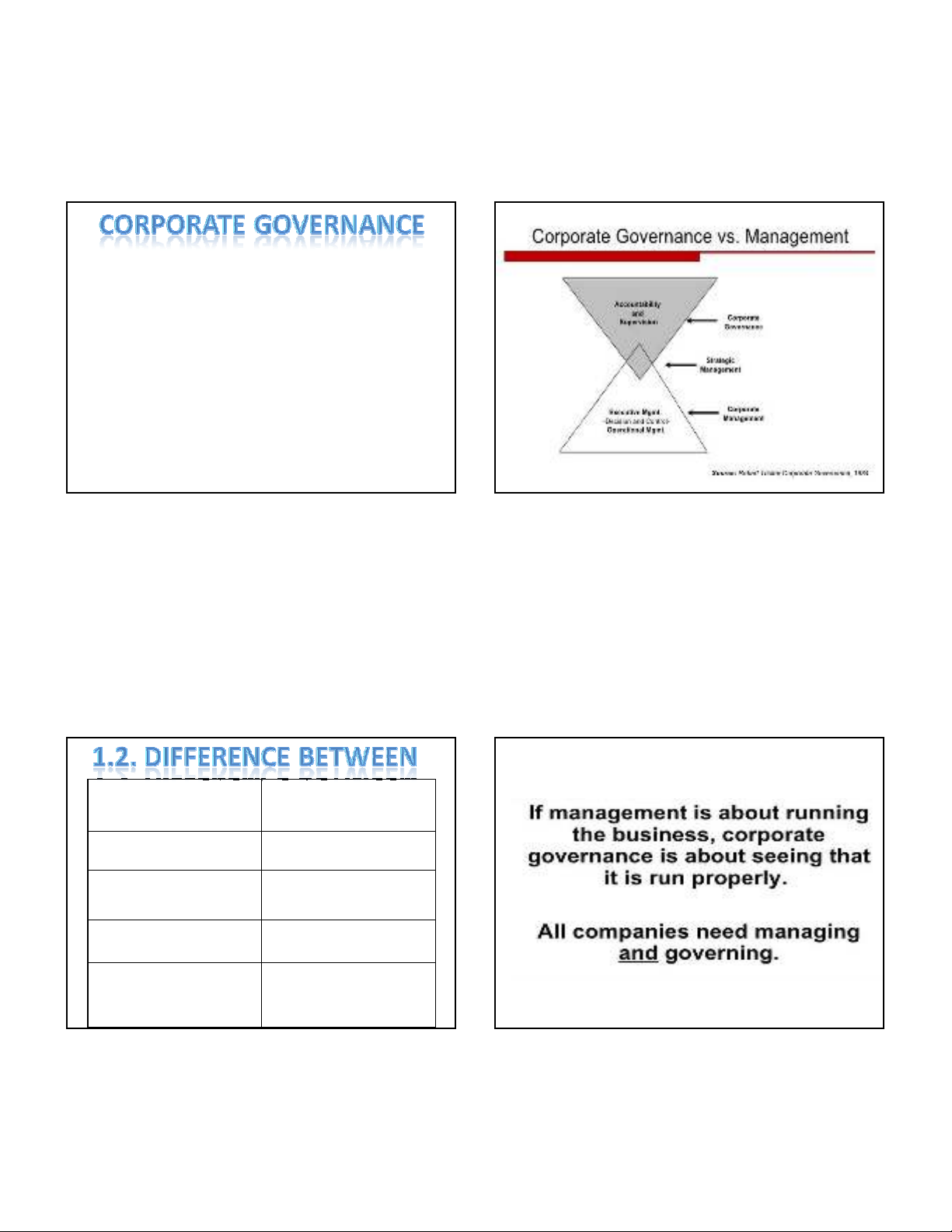
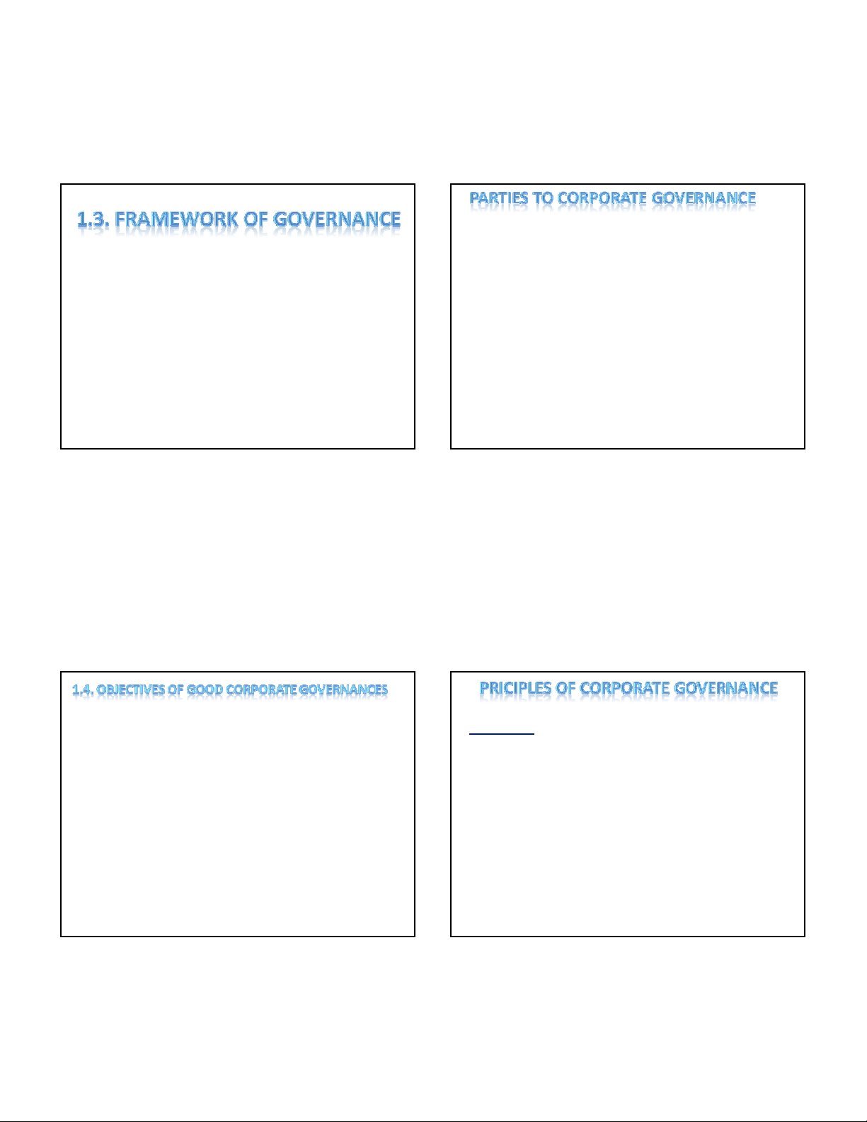
  1. 8/14/2013  A corporation is an organization created (incorporated) ICT Tools for CORPORATE by a group of shareholders who have ownership of the corporation. GOVERNANCE  The elected board of directors appoint and oversee management of the corporation . Chapter one: Corporate Governance  Oxford English dictionary defines “governance "as the Concepts act, manner , fact or function of governing sway control. 1.1. what is Corporate Governance  The word has Latin origins that suggest the notion of “steering". it deals with the processes and systems by which an organization or society operates.  Governance can be used with reference to all kind of organizational structure e.g.  Ngo –not for profit organization  Municipal corporation /gram panchyat  Central/state government  Partnership firm 1
  2. 8/14/2013 s  It is a broad concept and has been defined and understood differently by different groups and at different points of time .  The Cadbury committee report defines it as “the system by which companies are directed and controlled”. • “Corporate governance deals with the ways in which suppliers of finance to corporations assure themselves of getting a return on their investment”. • -The Journal of Finance, Shleifer and Vishny [1997]. CORPORATE CORPORATE GOVERNANCE MANAGEMENT External Focus Internal Focus Governance assumes an Management assumes a open system closed system Strategy-orientated Task-orientated Concerned with where the Concerned with getting company is going the company there 2
  3. 8/14/2013  Board of directors  Supervisory board/committee/team  Managers  Audit committee  Workers  Internal audit  Shareholders or owners  Statutory audit  Regulators  Disclosure of information  Customers  Risk management framework  Suppliers  Internal control framework  Community(people affected by the actions of the organization.)  Strengthen management oversight functions and Directors accountability.  Every listed company should be headed by an effective  Balance skills, experience and independence on the board which should lead and control the company. board appropriate to the nature and extent of company  There should be board balance of executive & non operations. executive directors such that no individual can dominate  Establish a code to ensure integrity. the board decision making.  Safeguard the integrity of company reporting.  The board should be supplied with timely information to  Risk management and internal control. enable it to discharge its duties.  Disclosure of all relevant and material matters.  There should be formal and transparent procedure for the appointment of new directors to the board.  Recognition and preservation of needs of shareholders.  All directors should be required to submit themselves for re-election at regular intervals and at least every three years. 3
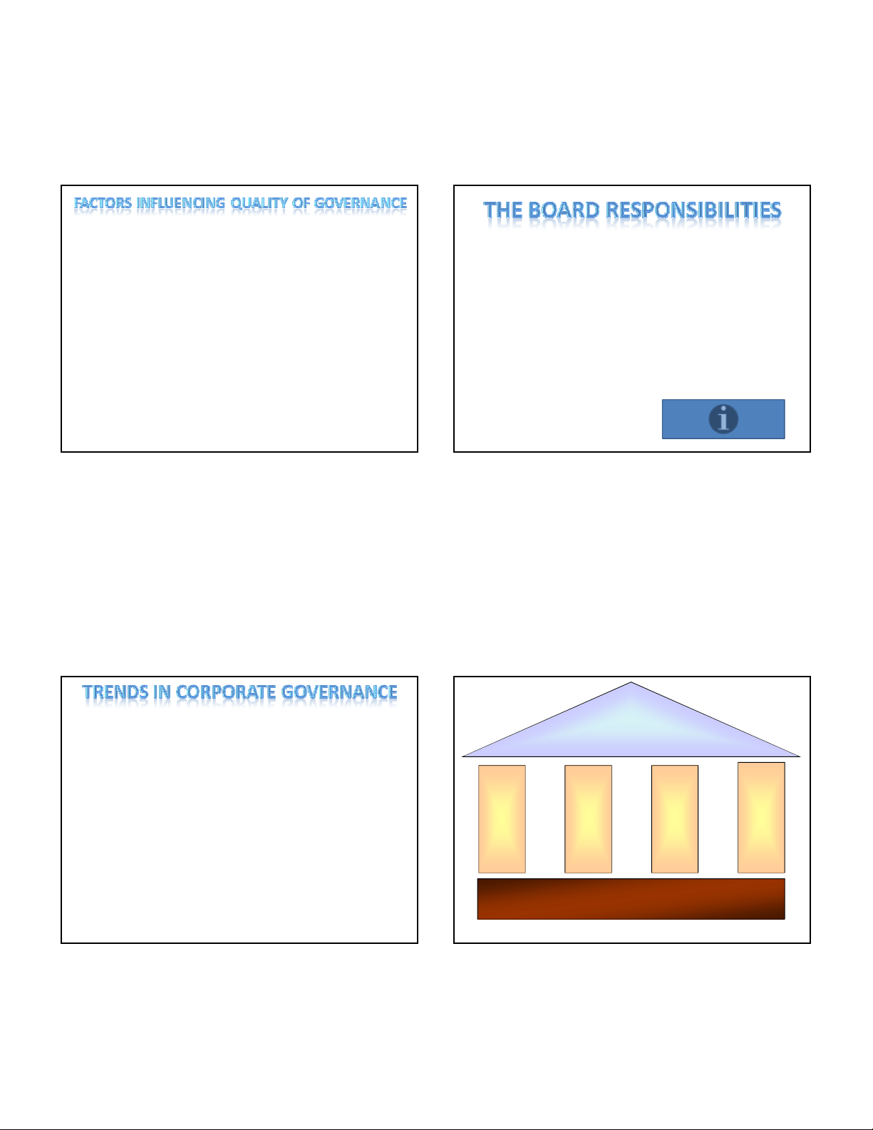
  4. 8/14/2013  Integrity of the management  Ability of the board  Overseeing strategic development & planning  Adequacy of the process  Management selection, supervision and upgrading.  Commitment level of individual board members  Maintenance of good member relations.  Quality of corporate reporting  Protecting and optimizing the organization’s assets.  Participation of stakeholders in the management  Fulfilling legal requirements. Example  Demand for greater transparency and accountability Corporate  Written job descriptions detailing roles and responsibilities Governance of chairman and board members. Accountability Responsibility Transparency  Core competencies for board members are defined and Fairness those without skills or expertise not invited.  Development of performance criteria and annual evaluations of the board.  Orientation for new members. Fundamental Pillars of Corporate  Ongoing training Governance  Succession planning 4
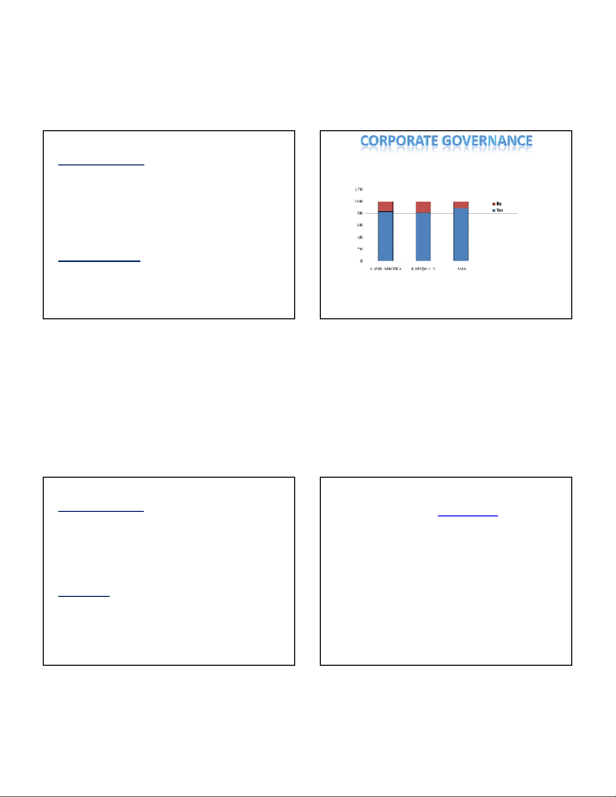
  5. 8/14/2013 Accountability Investors are Willing to Pay More For a Company With Good Board Governance Practices Clarifying governance roles & responsibilities, and supporting voluntary efforts to ensure the alignment of managerial and shareholder interests and monitoring by the board of directors capable of objectivity and sound judgment. 83 81 89 Transparency Requiring timely disclosure of adequate information Companies are willing to pay 18 % to 28% more for better concerning corporate financial performance governance. Chapter 2: 7 Basic Quality Control Responsibility Tools – 7 QC Tools Ensuring that corporations comply with relevant laws and • Check Sheet regulations that reflect the society’s values • Ishikawa Diagram • Pareto Chart • Control Chart Fairness • Histogram Ensuring the protection of shareholders’ rights and the enforceability of contracts with service/resource providers • Scattergram • Straticification 5
  6. 8/14/2013 2.1 Check Sheet Format • Definition: Is a form (document) used to • A typical check sheet is divided into regions, and marks collect data in real time at the location where made in different regions have different significance. Data are read by observing the location and number of the data is generated. The data it captures can marks on the sheet. be quantitative or qualitative. When the • Check sheets typically employ a heading that answers information is quantitative, the check sheet is the Five Ws: sometimes called a tally sheet. – Who filled out the check sheet • Use for collecting data – What was collected (what each check represents, an identifying batch or lot number) • Input for other analysis tools – Where the collection took place (facility, room, apparatus) • For example: – When the collection took place (hour, shift, day of the week) – Why the data were collected Function • To check the shape of the probability distribution of a process • To quantify defects by type • To quantify defects by location • To quantify defects by cause (machine, worker) • To keep track of the completion of steps in a multistep procedure (in other words, as a checklist) 6
  7. 8/14/2013 Check sheet to assess the shape of a process's probability distribution Check sheet for defect type • This type of check sheet consists of the • This type of check sheet consists of the following: following: • A grid that captures • A single column listing each defect category • The histogram bins in one dimension • One or more columns in which the • The count or frequency of process observations for different machines, materials, observations in the corresponding bin in the methods, operators are to be recorded other dimension • Lines that delineate the upper and lower specification limits 7
  8. 8/14/2013 Check sheet for defect location Checklist • This type of check sheet consists of the • This type of check sheet consists of the following: A to-scale diagram of the object following: from each of its sides, optionally partitioned • An (optionally numbered) outline of the into equally-sized sections subtasks to be performed • Boxes or spaces in which check marks may be entered to indicate when the subtask has been completed Check sheet for defect cause • This type of check sheet consists of the following: • One or more columns listing each suspected cause (for example machine, material, method, environment, operator) • One or more columns listing the period during which process outputs are to be observed (for example hour, shift, day) • One or more symbols to represent the different types of defects to be recorded—these symbols take the place of the check marks of the other types of charts. 8
  9. 8/14/2013 Exercise Categories • Use Excel to create a check sheet • People: Anyone involved with the process • Methods: How the process is performed and the • SeeMaterials\bldefck.xls; Materials\data- specific requirements for doing it, such as policies, analysis.xls procedures, rules, regulations and laws • Machines: Any equipment, computers, tools, etc. required to accomplish the job • Materials: Raw materials, parts, pens, paper, etc. used to produce the final product • Measurements: Data generated from the process that are used to evaluate its quality • Environment: The conditions, such as location, time, temperature, and culture in which the process operates 2.2 Ishikawa diagram • Also called fishbone diagrams, herringbone diagrams, cause-and-effect diagrams, or Fishikawa. (1968) • Show the causes of a specific event. • Use: product design and quality defect prevention to identify potential factors causing an overall effect. Each cause or reason for imperfection is a source of variation. Causes are usually grouped into major categories to identify these sources of variation. 9
  10. 8/14/2013 Example • The following example demonstrates the basic process: The vehicle will not start. (the problem). • Why? - The battery is dead. (first why) • Why? - The alternator is not functioning. (second why) • Why? - The alternator belt has broken. (third why) • Why? - The alternator belt was well beyond its useful service life and not replaced. (fourth why) • Why? - The vehicle was not maintained according to the recommended service schedule. (fifth why, a root cause) • Why? - Replacement parts are not available because of the extreme age of the vehicle. (sixth why, optional footnote) • Start maintaining the vehicle according to the recommended service schedule. (possible 5th Why solution) • Purchase a different vehicle that is maintainable. (possible 6th Why solution) The 6 Ms (used in manufacturing Causes industry) • Causes in the diagram are often categorized, such as to • Machine (technology) the 6 M's, described below. Cause-and-effect diagrams • Method (process) can reveal key relationships among various variables, • Material (Includes Raw Material, Consumables and and the possible causes provide additional insight into Information.) process behavior. • Man Power (physical work)/Mind Power (brain work): • Causes can be derived from brainstorming sessions. Kaizens, Suggestions These groups can then be labeled as categories of the • Measurement (Inspection) fishbone. They will typically be one of the traditional • Milieu/Mother Nature (Environment) categories mentioned above but may be something • The original 6Ms used by the Toyota Production System unique to the application in a specific case. Causes can have been expanded by some to include the following and be traced back to root causes with the 5 Whys are referred to as the 8Ms. However, this is not globally technique. recognized. It has been suggested to return to the roots of the tools and to keep the teaching simple while recognizing the original intent; most programs do not address the 8Ms. • Management/Money Power • Maintenance 10
  11. 8/14/2013 The 7 Ps (used in marketing industry) 5 Ws • Product=Service • Where • Price • What • Place • When • Promotion • Who • People/personnel • Why • Process • Physical Evidence The 5 Ss (used in service industry) Creating the Diagram • Surroundings • Step 1: Create a horizontal line in the center of • Suppliers your page or whiteboard with a circle at one • Systems end. The Ishikawa diagram is called the fishbone diagram because of this shape: The • Skills line is the fish's spine, and the circle is its • Safety head. Write down the problem, the known effect, at the head 11
  12. 8/14/2013 • Step 2: Consider how many categories of • Step 4: Expand any aspects that can be causes add to that effect. This is where you discussed further. On the People rib, examine may use the four Ps, six Ms or another set of the employees that have some influence on categories. Create as many ribs as you have the effect you are discussing. categories, drawing them at 60-degree angles to the spine. Write the category at the end of the rib. Analyzing the Diagram • Step 3: List all the aspects under the • Step 5: Focus on the ribs that are full. Are there categories. For example, if you used the four serious problems that need to be addressed? Ps, each P should have its aspects written • Step 6: Discuss the most likely causes of your down the rib.The “People” category might list problem and conduct further research to see if all the employees in the organization. those causes are valid. • Step 7: Meet with your team to brainstorm creative solutions. Use the information from your research and all your team’s ideas to address the problems that you identified. 12
  13. 8/14/2013 EX see more Materials\fishbone- cause-and-effect-diagram.xls • Use Excel to create a Ishikawa diagram about flight delay 2.3. Perato Chart • is a type of chart that contains both bars and a • The Pareto diagram is a graphical overview of line graph, where individual values are the process problems, in ranking order of the represented in descending order by bars, and most frequent, down to the least frequent, in the cumulative total is represented by the descending order from left to right. line. • Thus, the Pareto diagram illustrates the frequency of fault types. • Using a Pareto, you can decide which fault is the most serious or most frequent offender. 13
  14. 8/14/2013 The basic underlying rule Chart • In almost every case, 80% of the total problems incurred are caused by 20% of the problem cause types; such as people, machines, parts, processes, and other factors related to the production of the product. • Example: it is wise to ask • "Does the Caulking problem have any impact on the other problems listed?" • In some cases it might. If there was proper caulking, would part of the "Gapping" problem be eliminated?“ • If there were proper caulking, would the "Torque" have a better value and thus not be part of the defects? • Sometimes your major problems have impact on the smaller problems. Several problem areas may all be attributed to ONE ROOT CAUSE, even though several failure modes are observed. • It is always wise to choose the most frequent problem first. 14
  15. 8/14/2013 How To Make A Pareto Diagram Example • STEP #1 - Determine the category classifications that you are going to use to group your defect data by. Use your check sheets to collect the data for the Pareto. • STEP #2 - Decide on the time period to be used to record your information. One week, a month, etc. It is best to be consistent so that you have a standard to compare to if the data collection exercise is to be repeated again. You can't measure results achieved accurately without consistent measurement periods. • STEP #3 - From the Check Sheet, total the • STEP #5 - Make your scale units at even occurrence of each item for the period measured. Each total will be represented by the multiples, such as 10, 20, etc. so as to have an length of a vertical bar, much like the Pareto even scale system chart example above. • STEP #4 - (It is easier to keep your scale accuracy correct if you use graph paper). Draw horizontal and vertical axes on graph paper; or if no graph paper available, use a ruler to measure and draw evenly scaled vertical and horizontal lines that meet evenly 15
  16. 8/14/2013 • STEP #6 - Draw in the bars that correspond to • STEP #7 - Under the horizontal axis (line), the total numbers collected from your Check label each of the bars so that you know Sheet, starting on the far left, with the most frequent (highest number recorded) defective which defect is represented by which bar. item. It is recommended that you leave a gap between each item bar for reading clarity. (Note: STEP #8 - Draw another vertical line and label If you have several defective items with very the percentage scale in the same manner small quantities, you can group them together in that you did on the left side a category called "other", as long as their total is less than the previous bar heighth). 16
  17. 8/14/2013 Do it in Excel • STEP #9 - Plot a dot for each item on the graph, starting from the • Data Preparation left side, on or above the bar corresponding to the related percentage of defectives for each item. Once each dot is plotted, – Organize the data in three columns, the first column use a ruler and connect the line graph from dot-to-dot, as shown containing the categories (or events), the second column in the "Pareto example" up above. containing frequency and the third column containing • relative priority (e.g., percentage of total events). Sort the data in order of increasing frequency so that a STEP #10 - Title the graph and briefly write the source of the data combination chart can be prepared to analyze the impact below the graph, that describes the data and method used to of the events and provide insight about each event's gather. Include all pertinent facts which will define the method of relative importance. observation (for example, time period, production line, and • Select the columns and sort the data. Make sure to whether this was before or after any modifications to the line). Recording this data on the bottom of your chart, will help further select the second column in the drop-down menu for analysis as well as to provide a record of what was done on this the first criterion and specify the sort in "Descending" date, for consideration in future studies. order. Click "OK" to perform the sort function. • Combination Chart – To create a combination chart, first create a basic chart from the data and then format the second series of data for the secondary or z axis with a different chart type. Select the data (three columns) and then select "Chart" under "Insert" in the top menu bar to activate the Chart Wizard. Select a column chart as the primary chart type for a Pareto chart and click the "Next" button. Continue through the Chart Wizard and type the desired information in the fields (such as "Chart title" and "Category (X) axis") and select the chart options (such as legend, data labels and gridlines). Choose whether to place the chart on the data page or on a separate sheet in the workbook. 17
  18. 8/14/2013 • Right-click the second data series (second set of colored bars) and select "Format Data Series." Specify this series as the secondary axis under the "Axis" tab in the dialog box before clicking "OK" to save the settings. Apply a different chart type to this series by selecting "Chart Type" under "Chart" in the top menu bar. Select "Line" as the chart type to complete the Pareto chart Test Your Learning - Class Exercise Chart result • From the Production Defect Check Sheet Materials\defecsamp.doc you will need to total the number of occurrences (N) then divide each individual defect by (N) to determine the percentage of overall defects, that each defective item represents. When you are finished, check your answers against "Check Your Work" below. 18
  19. 8/14/2013 2.4 Control Chart Steps In Making the Xbar and R Chart • STEP #1 - Collect the data. It is best to have at least 100 samples. • Control charts are generally used in a • STEP #2 - Divide the data into sub groups, it is recommended the production or manufacturing environment subgroups be of 4 or 5 data points each. The number of samples is represented by the letter " n " and the number of subgroups is and are used to control, monitor and represented by the letter " k ". The data should be divided into subgroups in keeping with the following conditions: IMPROVE a process. • The data obtained should be from the same grouping of products produced. • Common causes are always present and • A sub group should not include data from a different lot or generally attributed to machines, material different process. • STEP #3 - Record the data on a data sheet. Design the sheet so and time vs. temperature. that it is easy to compute the values of X bar and R for each sub group (see the page in the class example). • STEP #4 - Find the mean value (Xbar). Use the following formula for each subgroup: • There are basically three kinds of control lines: • the upper control limit (UCL), STEP #5 - Find the range, R. Use the following formula for each subgroup.R = X (largest value) - X (smallest • the central line (actual nominal size of value) Example 14.0 - 12.1 = 1.9 product), • the lower control limit (LCL). 19
  20. 8/14/2013 Other exercise • CLASS EXERCISE Materials\control • On the same Work Sheet that you just computed exercise.xls the X double bar figures, now compute the R bar • STEP #6 - Find the overall mean, or X double explained above. bar . Total the mean values of Xbar, for each • STEP #8 - Compute the Control Limit Lines. Use subgroup and divide by the number of the following formulas for Xbar and R Control subgroups (k). Charts. The coefficients for calculating the control lines are A2, D4, and D3 are located on the bottom of the Work Sheet you are presently using, and presented here: • STEP #7 - Compute the average value of the range (R). Total R for all the groups and divide by the number of subgroups (k). 20
ADSENSE

CÓ THỂ BẠN MUỐN DOWNLOAD


Đồng bộ tài khoản
2=>2