III Part 3: Extras
Answers: Quiz #1 (page84)
Remove the border to open up space. New designers tend to put borders around
everything. Stop it! Let it breathe. Don't contain it so tightly!
proximity
The headings are too far away from their related items: move them closer.
There are double Returns above and below the headings: take out all double
Returns,but add a little extra spaceabove the headingsso they
are more
closely
connected to the following material they belong with.
Separate personal info from resume items with a little extra space.
Alignment
Text is centered and flush left, and second lines of text return all the way to the left
edge: create a strongflush left alignment-all heads align with each other, all bullets
align, all text aligns, second lines of text align with first lines.
Repetition
There is already a repetition of the hyphen: strengthen that repetition by
making it a more interesting bullet and using it infront of every appropriate item.
There is already a repetition in the headings: strengthen that repetition
by making the headings strong and black.
The strong black impression in the bullets now repeats and reinforces the strong
black in the headings.
Contrast
There isn't any: use a strong, bold face for contrast of heads, including "Resume"
(to be consistent, or repetitive); add contrast with the strong bullets.
By the way: all the numbers in the new version are a point size smaller so they
don't call undue attention to themselves.
Answers: Quiz #2 (page85)
Different typefaces: There are four different sans serifs (Helvetica, Avant
Garde, Optima, and Formata Bold). There are two serif faces (Aachen Bold and
New Century Schoolbook). Choose two of those: one nice strong bold (such as
the Aachen Bold) and one sans serif.
Different alignments: Oh my gawd. Some elements are flush left, some are
centered, some are centered in the middle of empty space, some have no
connection or alignment with anything else in the world.
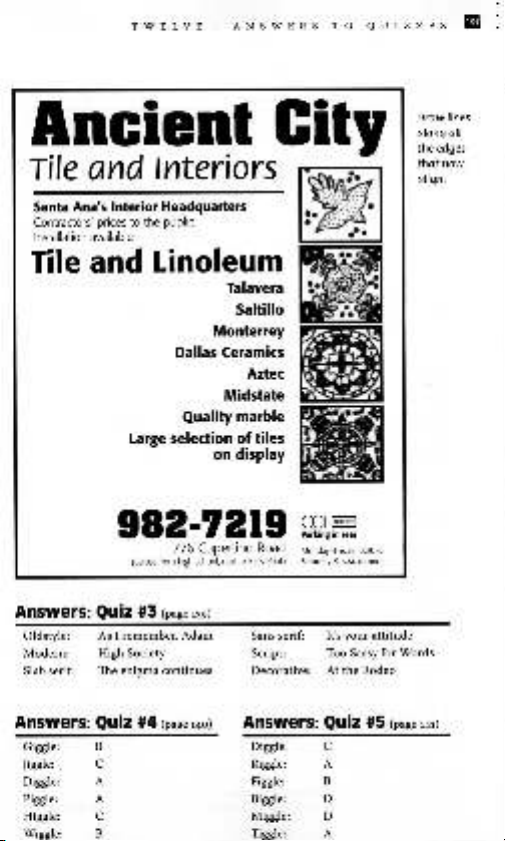
strong line: The graphic image of tiles could provide a strong line against
which to align other elements.
Lack of proximity: Group the information. You know what should be grouped
together.
Lack Of focal point: Several items are competing for attention. Choose one.
Lack of repetitive elements: How about taking those bullets and making
them stronger, including the bullet between tile and linoleum. Perhaps use a
square bullet, to repeat the square tile. Repeat the bold face in the large phone
number, since this is a phone book ad.
Remove the border inside the border. Use square corners on the remaining
border to reinforce the square corners of the tile and to keep the edges clean.
TAKE OFF THE CAPS LOCKIII
The example on the next page is only one of many possibilities!
TWELVE: ANSWERS TO QUIZZES III'
Ancient City
Tile and Interiors :.
SantaAna'sInteriorHeadquarters ~
Contractors'pricestothepublic :~.
Installationavailable ,,-
Tile and Linoleum
Talavera
Saltillo
Monterrey
Dallas Ceramics
Aztec
Midstate
Quality marble
Large selection of tiles
on display
Draw lines
along all
the edges
tl1atnow
align.
982.7219 ~.~
1776 Cupertino Road Monday-Friday8:30-5
(across
from high
school.
next to
Easy
Print)
Saturday 9 A.M. to noon
Answers: Oulz #3 (page139)
Oldstyle:
Modern:
Slabserif:
As I remember, Adam
High Society
The enigma continues
Answers: Oulz #4 (page140)
Giggle: B
Jiggle: C
Diggle: A
Piggle: A
Higgle: C
Wiggle: B
Sans serif: It's your attitude
Script: Too Sassy for Words
Decorative: At the Rodeo
Answers: Oulz #5 (page
141)
Diggle: C
Riggle: A
Figgle: B
Biggle: D
Miggle: D
Tiggle: A
lIB Part 3: Extras
Fancy Perfume:
Answers: Quiz #6 (page172)
Dogfood:
My Mother:
Funny Farm:
Let's Dance:
conflict. There are too many similarities: they are both all caps;
they are both about the same size; they are both "fruEru" type-
faces (kind of fancy); they are similar in weight.
contrast. There is a strong contrast of size, color, form (both
caps vs.lowercase and roman YS.italic), weight, and structure
(although neither typeface has a definite thick/thin contrast
in their strokes, the two faces are definitely built out of very
different materials).
conflict. Although there is a contrast of form in the caps vs.
lowercase. there are too many other similarities that conflict.
The two faces are the same size. very similar weight. the same
structure, and the same roman form. This is a twitcher.
conflict. There is potential here, but the differences need to be
strengthened. There is a contrast of form in the caps vs. lower-
case, and also in the extended face vs. the regular face. There is a
slight contrast of structure in that one face has a gentle thick/thin
transition and the other has monoweight, extended letters. Can
you put your finger on the biggest problem? (Think a minute.)
What is the focus here? "Health Insurancen is trying to be the
focus by being larger, but it uses a light weight face. "Funny Farm"
is trying to be the focus, even though it's smaller, by using all caps
and bold. You have to decide which one is the boss and emphasize
one of the concepts, either "Funny Farm" or "Health Insurance:'
Contrast. Even though they are exactly the same size and from
the same family (the Formata family), the other contrasts are
strong: weight, form (roman vs. italic and caps vs. lowercase),
structure (from the weight contrasts), color (though both are
black, the weight of "dance" gives it a darker color).
Answers: Quiz #7 (page173)
1. Don't. Two scripts will conflict with each other because they usually have
the same form.
2. Don't. Typefaces from the same category have the same structure.
3. Don't. They will fight with each other. Decide what is the most important
and emphasize that item.
4. Don't. Most scripts and italics have the same form-slanted and flowing.
5. Do. You instantly have a strong contrast of structure and color.
6. DO. You instantly have a contrast of structure and color.
7. Don't. Two fancy faces will usually conflict because their fancy features
both compete for attention.
8. Don't. Your purpose in putting type on a page is usually to communicate.
Never forget that.
9. DO.
10. DO. The basic law of breaking the rules is to know what the rules are in
the first place. If you can justify breaking the rules-and the result works-
go ahead!
BI
& l
- -
Th're~~~~j~dd_~~~
books, magazines. we~sites. The ones l~te o~se two p~gls are just the
ones that I happen to Know about and liKe,w ich-~an others aren't
~u~~
I I -~
Magazines
If you like magazines to arrive in your mailbox so you can hold information in your
hands, you're in luck. Everyone of these magazines is great, and each of their web
sites is great as well.
BEFORE &After: How to design
cool stuff
www.BAmagazlne.com
This is the best magazine for new designers. Really terrific stuff.
HOW
www.HOWdeslgn.com
This is more advanced design concepts; very how.to oriented.
Print
www.PrintMag.com
This is also more advanced design concepts; very how-to oriented.
Mac Design
www.MacDeslgnOnllne.com
A Mac-specific design magazine with tips for lots of applications.
Communication Arts
www.commArts.com/CA
CA is a showcase of top designers around the world.
Web sites
There is so much available on the web to help aspiring designers. Between the two
sites listed below. you will find everything you need to on the web.
GraphicDeslgn.about.com
Judy Litt hosts this great site with an abundance of selected links to articles. design tips
for both print and web, clip art, photography, free fonts, design schools, finding a job,
tutorials in design software. and much more.
VlrtualLastChapter.coml
This is the web site that shows live pages of the sites John and I show in the Web Design
Workshop book. Click "Resource Linksn to find links to type foundries. clip art. and more.
lEI! Part 3: Extras
Design
Rather than give you a lengthy list of books, this is the web site for the Graphic
Design Book Club. There you will have access to every book in the field, from recent
publications to great classics.
www.GraphicDesignBookClub.com
Robin Williams Design Workshop
Robin Williams and John Tollett, Peachpit Press
When you're finished with The Non-Designer's Design Book and want more, check out
this book.
Editing by Design
Jan V. White, R.R. Bowker Company
This classic should be a standard in your design library. Includes a wonderful discussion
and examples of grid theory.
TYpography
Design with Type
Carl Dair. University of Toronto Press
A classic, brilliant book on typography, particularly focusing on contrasting type.
Stop Stealing Sheep &find out how type works, second edition
Erik Spiekermann & E.M. Ginger, Adobe Press
Another brilliant and very contemporary book on typography.
The Mac is not a typewriter, second edition; or The PC is not a typewriter
Robin Williams, Peachpit Press
Basic primer on switching from typewriter skills to professional typographic standards.
The Non-Designers Type Book
Robin Williams, Peachpit Press
More advanced typographic concepts than appear in The Mac/pc is not a typewriter,
but specifically written for aspiring designers. This book is cross- platform.
Ideas and concepts
How to Get Ideas
Jack Foster; illustrations by Larry Corby. Berrett-Koehler Publishers.
I love this book.


![Giáo Trình CorelDraw 2: Thiết Kế Đồ Họa Ứng Dụng [Mới Nhất]](https://cdn.tailieu.vn/images/document/thumbnail/2026/20260529/alfredodistefano10/135x160/30281780300213.jpg)


%20--%3e%3cdefs%3e%3cstyle%3e%20.st0%20{%20fill:%20%23fff;%20}%20.st1%20{%20fill:%20%237800fa;%20}%20%3c/style%3e%3c/defs%3e%3cpath%20class='st1'%20d='M117.78,12.18H43.11c2.9,3.47,4.65,7.94,4.65,12.82,0,5.6-2.3,10.66-6.01,14.29h76.02l7.22-13.56-7.22-13.56Z'/%3e%3cg%3e%3cpath%20class='st0'%20d='M53.58,26.17h-.59v-1.46h.59v-4.96h2.83c1.78,0,2.67.94,2.67,2.82v5.76c0,1.87-.89,2.81-2.67,2.81h-2.83v-4.96ZM55.36,21.37v3.34h1.1v1.46h-1.1v3.34h1.01c.61,0,.91-.37.91-1.1v-5.93c0-.74-.3-1.1-.91-1.1h-1.01Z'/%3e%3cpath%20class='st0'%20d='M65.99,31.14h-1.8l-.31-2.07h-2.19l-.31,2.07h-1.64l1.82-11.39h2.62l1.82,11.39ZM65.28,18.04c-.25.46-.51.77-.75.94-.21.15-.47.22-.79.22-.26,0-.57-.07-.92-.22l-.38-.15c-.14-.05-.26-.07-.37-.07-.3,0-.53.18-.71.54l-.91-.68c.25-.46.51-.77.75-.94.21-.14.48-.21.79-.21.26,0,.57.07.92.21l.38.15c.14.05.26.07.37.07.3,0,.53-.18.71-.54l.91.68ZM61.91,27.52h1.73l-.87-5.76-.87,5.76Z'/%3e%3cpath%20class='st0'%20d='M74.53,26.89v1.52c0,1.91-.89,2.86-2.67,2.86s-2.67-.95-2.67-2.86v-5.93c0-1.91.89-2.86,2.67-2.86s2.67.95,2.67,2.86v1.11h-1.69v-1.22c0-.75-.31-1.12-.93-1.12s-.93.37-.93,1.12v6.15c0,.74.31,1.11.93,1.11s.93-.37.93-1.11v-1.63h1.69Z'/%3e%3cpath%20class='st0'%20d='M81.4,31.14h-1.8l-.31-2.07h-2.19l-.31,2.07h-1.64l1.82-11.39h2.62l1.82,11.39ZM75.9,19.2l1.52-1.91h1.71l1.51,1.91h-1.61l-.76-.95-.75.95h-1.61ZM77.32,27.52h1.73l-.87-5.76-.87,5.76ZM83.1,15.99l-1.76,1.91h-1.26l1.17-1.91h1.86Z'/%3e%3cpath%20class='st0'%20d='M84.86,19.75c1.78,0,2.67.94,2.67,2.82v1.48c0,1.87-.89,2.81-2.67,2.81h-.85v4.28h-1.79v-11.39h2.64ZM84.01,21.37v3.86h.85c.58,0,.87-.36.87-1.08v-1.71c0-.71-.29-1.07-.87-1.07h-.85Z'/%3e%3cpath%20class='st0'%20d='M93.51,19.75c1.78,0,2.67.94,2.67,2.82v1.48c0,1.87-.89,2.81-2.67,2.81h-.85v4.28h-1.79v-11.39h2.64ZM92.66,21.37v3.86h.85c.58,0,.87-.36.87-1.08v-1.71c0-.71-.29-1.07-.87-1.07h-.85Z'/%3e%3cpath%20class='st0'%20d='M98.8,31.14h-1.79v-11.39h1.79v4.88h2.03v-4.88h1.83v11.39h-1.83v-4.88h-2.03v4.88Z'/%3e%3cpath%20class='st0'%20d='M105.36,24.55h2.46v1.62h-2.46v3.34h3.09v1.63h-4.88v-11.39h4.88v1.63h-3.09v3.18ZM108.17,17.29l-1.76,1.91h-1.26l1.17-1.91h1.86Z'/%3e%3cpath%20class='st0'%20d='M112.2,19.75c1.78,0,2.67.94,2.67,2.82v1.48c0,1.87-.89,2.81-2.67,2.81h-.85v4.28h-1.79v-11.39h2.64ZM111.35,21.37v3.86h.85c.58,0,.87-.36.87-1.08v-1.71c0-.71-.29-1.07-.87-1.07h-.85Z'/%3e%3c/g%3e%3ccircle%20class='st1'%20cx='25'%20cy='25'%20r='20'/%3e%3cpath%20class='st0'%20d='M32.78,19.27c2.92,0,4.43,2.55,5.28,5.33l.71,2.17c.14.38-.33.75-.71.75h-5.61c.19-.33.24-.71.09-1.08l-.75-2.45c-.43-1.32-.99-2.64-1.79-3.77.75-.57,1.65-.94,2.78-.94h0ZM25,18.38c3.25,0,4.9,2.78,5.89,5.89l.76,2.45c.14.42-.33.8-.8.8h-11.69c-.42,0-.94-.38-.8-.8l.75-2.45c.99-3.11,2.64-5.89,5.89-5.89h0ZM25,11.35c1.74,0,3.11,1.37,3.11,3.11s-1.37,3.11-3.11,3.11-3.11-1.41-3.11-3.11,1.41-3.11,3.11-3.11h0ZM17.27,19.27c1.08,0,1.98.38,2.73.94-.8,1.13-1.37,2.45-1.74,3.77l-.8,2.45c-.14.38-.05.75.09,1.08h-5.56c-.42,0-.9-.38-.75-.75l.71-2.17c.9-2.78,2.41-5.33,5.33-5.33h0ZM17.27,12.91c1.51,0,2.78,1.27,2.78,2.83s-1.27,2.83-2.78,2.83-2.83-1.27-2.83-2.83,1.27-2.83,2.83-2.83h0ZM32.78,12.91c1.56,0,2.78,1.27,2.78,2.83s-1.23,2.83-2.78,2.83-2.83-1.27-2.83-2.83,1.27-2.83,2.83-2.83h0ZM27.07,28.56v.09c0,.57-.24,1.08-.61,1.46h0v.05c-.38.33-.9.57-1.46.57s-1.08-.24-1.46-.61h0c-.38-.38-.61-.9-.61-1.46v-.09h1.41v.09c0,.19.05.38.19.47v.05c.09.09.28.19.47.19s.38-.09.47-.19v-.05c.14-.09.24-.28.24-.47t-.05-.09h1.41ZM30.99,28.56v.09c0,1.65-.66,3.16-1.74,4.24-1.08,1.08-2.59,1.79-4.24,1.79s-3.16-.71-4.24-1.79l-.05-.05c-1.04-1.08-1.7-2.55-1.7-4.2v-.09h1.41v.09c0,1.27.47,2.4,1.27,3.25h.05c.85.85,1.98,1.37,3.25,1.37s2.4-.52,3.25-1.37c.85-.8,1.37-1.98,1.37-3.25v-.09h1.37ZM34.99,28.56v.09c0,2.78-1.13,5.28-2.92,7.07-1.79,1.79-4.29,2.92-7.07,2.92s-5.23-1.13-7.07-2.92c-1.79-1.79-2.92-4.29-2.92-7.07v-.09h1.41v.09c0,2.4.94,4.53,2.5,6.08,1.56,1.56,3.72,2.5,6.08,2.5s4.52-.94,6.08-2.5c1.56-1.56,2.5-3.68,2.5-6.08v-.09h1.41Z'/%3e%3c/svg%3e)