
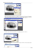
9
Use the Dodge tool to add highlights to the bridge of the nose, the cheeks,
above the lip area, the lower lip, the chin, and the eyes. Merge the two
layers together to form a solid.
10
Apply a Lighting Effect following the specifications below.
11
Here we have the finished piece.
Technical Support Forum : http://vietdown.org/vbb/index.php
MAKING MEDALS IN PHOTOSHOP
by Colin Smith
Hi all,
I've been quiet for a few weeks because I have been traveling in Italy. Speaking of
travel, a lot of people have been traveling to Salt Lake City for the Winter
Olympics. You may not have had a chance to go to Utah, but you will be able to
take a medal home with you.
I am going to show you how to create a medal here.. We are going to create a
medal for the fictitious "snow bike" category in the fictitious 2001 Olympics, sorry
purists :)
Begin with a blank canvas at 72ppi and RGB mode.
Import your art onto a separate layer. I used the font "webdings" here with the
letter "b" which happens to be a bicycle.
Using the elliptical marquee tool draw a circle around the bike.
Create a new layer and fill it with the default copper gradient.

Add some type. "2001 Salt Lake City."
Lets wrap the text to the circle.
On the toolbar, click the warp text tool.
Choose arc and adjust the bend to suit. Tip: You can drag the text to a different
position while this tool is active.
Here is the result so far.
Lets make the Olympic rings.
Create a new layer and using the elliptical marquee tool make a circle. Hold the
shift key to constrain to a perfect circle.
Edit>Stroke
Use a 2 pixel black stroke to create a ring.
Now here is a great tip to duplicate the rings:
Press Ctrl/Cmd+Click the layer thumbnail to load the ring as a selection.
Press the alt/option key and click on the ring and drag a copy. Do this 3 more times
to create all 5 Olympic rings.
Position everything and add the word "Olympic" in a suitable font.
Merge the bicycle and "2001 Salt Lake City" text.
Filter>blur>gaussian blur
Run a 1.1 pixel Gaussian blur, this will cause these elements to blend more
smoothly with the coin.
The result
Ok prep time over. Lets make this puppy pop!
Start with the bike layer. Double click the layer name to open the layer styles box.
Copy the settings from the bevel box. Don't forget to change the gloss contour.
Choose a color overlay and select orange as the color.
Its beginning to take shape.

Copy the layer style to all the layers.
You can do this by just clicking on the word "Effects" and dragging it to any layer
you want and the effect will be duplicated.
Here is our medal with the layer style applied to all layers.
Lastly we will modify the style on the coin surface to produce a realistic result.
Double click the word "effects" to open the dialog box again.
Make these changes to the bevels setting.
Add a default drop shadow.
To get a nice shimmer, apply the satin effect.
Here is our finished medal.
I hope this weeks article inspires you to create all kinds of medals and coins.
Technical Support Forum : http://vietdown.org/vbb/index.php
Making Photograph Adjustments Using New Adjustment Layer
Jacquelin Vanderwood
1
I'll show you how to use New Adjustment Layer in this tutorial. As you
can see from the screenshot below, New Adjustment Layer is located
under Layer.
2
The New Adjustment Layer feature allows you to create adjustments to
your photo or artwork one layer at a time. When you select, in this

instance Levels, you are asked to name the layer and would you like to
Group With Previous Layer. I most always check this box. You can color
the layer and give it a transparency factor using Mode. You can also
specify it's opacity. Go ahead and select Levels for this demonstration.
3
Immediately the Levels dialogue box appears allowing you to specify
Channels and Input and Output levels.
4
After I have made adjustments in Levels and press OK, you can see in the
Layers palette that a new indented layer has appeared. You can hide this
layer or change it's transparency mode, plus reduce it's opacity.
5
The first photo below is with the Levels layer hidden. The second photo is
with the Levels layer unhidden.
6
He
re is the same photo with the Levels layer set at Exclusion.
7
I have a applied a Hue/Saturation New Adjustment Layer to the photo.
See how it also is indented. Here is the effect of the two New Adjustment
Layers applied to our photo. You can keep going and going and making
adjustment layers this way, changing their transparency mode, etc. It's an

easy and economical way to make changes to your photo or artwork while
maintaining the integrity of the original piece.
Technical Support Forum : http://vietdown.org/vbb/index.php
MAKING TEXT LOOK SHARPER ON YOUR WEBPAGE
By Colin Smith
There are a few little tricks that will help your text look a bit sharper on your
webpages, especially at smaller sizes.
Resizing
When resampling blocks of text, there is an option that you may not have noticed,
that will help you achieve sharper results. This is particularly useful when you
have scanned in blocks of text or line art.
When we go to resize the image, Bicubic resampling is the default option. This
works best for most images.
Here is the result on our text.
Try it again, this time choose bilinear resampling
Notice how much sharper the text is?


![[Mới Nhất] 23 Phục Chế Ảnh Chuyên Nghiệp, Phần 6](https://cdn.tailieu.vn/images/document/thumbnail/2011/20110723/kemoc10/135x160/23_bai_phuc_hoi_anh_chuyen_nghiep_06_6448.jpg)
![[Mới nhất] 23 Phục chế ảnh chuyên nghiệp, phần 5](https://cdn.tailieu.vn/images/document/thumbnail/2011/20110723/kemoc10/135x160/23_bai_phuc_hoi_anh_chuyen_nghiep_05_3964.jpg)
![[Mới Nhất] 23 Phục Chế Ảnh Chuyên Nghiệp (Phần 4)](https://cdn.tailieu.vn/images/document/thumbnail/2011/20110723/kemoc10/135x160/23_bai_phuc_hoi_anh_chuyen_nghiep_04_1346.jpg)
![23 Phục Chế Ảnh Chuyên Nghiệp (Phần 2): [Hướng Dẫn Chi Tiết]](https://cdn.tailieu.vn/images/document/thumbnail/2011/20110723/kemoc10/135x160/23_bai_phuc_hoi_anh_chuyen_nghiep_02_5559.jpg)
![[2024] 23+ Phục chế ảnh chuyên nghiệp: Phần 1 chi tiết](https://cdn.tailieu.vn/images/document/thumbnail/2011/20110723/kemoc10/135x160/23_bai_phuc_hoi_anh_chuyen_nghiep_01_0427.jpg)


![Giáo trình Kỹ xảo video Trường Cao đẳng Cơ điện Hà Nội [Mới nhất]](https://cdn.tailieu.vn/images/document/thumbnail/2026/20260323/lionelmessi01/135x160/79751774382791.jpg)


![Giáo trình Thiết kế dàn trang - Trường Cao đẳng Cơ điện Hà Nội [Chuẩn nhất]](https://cdn.tailieu.vn/images/document/thumbnail/2026/20260323/lionelmessi01/135x160/91811774428442.jpg)
