Tuan V. Nguyen Senior Principal Research Fellow, Garvan Institute of Medical Research Professor, UNSW School of Public Health and Community Medicine Professor of Predictive Medicine, University of Technology Sydney Adj. Professor of Epidemiology and Biostatistics, School of Medicine Sydney, University of Notre Dame Australia

Phân tích dữ liệu và ứng dụng | Đại học Dược Hà Nội | 12/6 to 17/6/2019

© Tuan V. Nguyen

Biểu đồ

• Phân bố: histogram

• Tần số: barplot

• So sánh: boxplot

• Liên quan: scatterplot

Obesity data (Vietnam)

• Cross-sectional study of obesity in Vietnam

• Aim: to predict percent body fat (pcfat) by using gender, age, bmi.
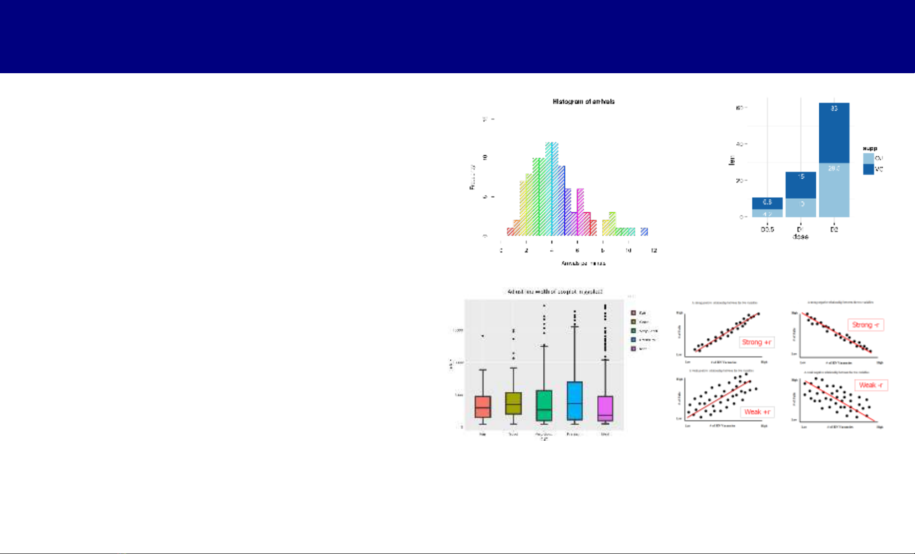
dat = read.csv("~/Dropbox/_Conferences and Workshops/TDTU 2018/Datasets/obesity data.csv")

dim(dat) [1] 1217 11

head(dat)

id gender height weight bmi age WBBMC wbbmd fat lean pcfat 1 1 F 150 49 21.8 53 1312 0.88 17802 28600 37.3 2 2 M 165 52 19.1 65 1309 0.84 8381 40229 16.8 3 3 F 157 57 23.1 64 1230 0.84 19221 36057 34.0 4 4 F 156 53 21.8 56 1171 0.80 17472 33094 33.8 5 5 M 160 51 19.9 54 1681 0.98 7336 40621 14.8 6 6 F 153 47 20.1 52 1358 0.91 14904 30068 32.2

Histogram

Biểu đồ phân bố: geom_histogram()

• Mục tiêu: mô tả phân bố của dữ liệu

• Có thể so sánh phân bố giữa 2 hay nhiều hơn 2 nhóm

• Ví dụ: Phân bố của pcfat (tỉ trọng mỡ)

dat = read.csv("~/Dropbox/_Conferences and Workshops/TDTU 2018/Datasets/obesity data.csv")

# Biểu đồ đơn giản

library(ggplot2); library(gridExtra)

p = ggplot(data=dat, aes(x=pcfat))

p1 = p + geom_histogram(color="white", fill="blue")

p = p + geom_histogram(aes(y=..density..), color="white", fill="blue")

p2 = p + geom_density(col="red")

grid.arrange(p1, p2, ncol=2)

100

0.06

# Biểu đồ đơn giản library(ggplot2); library(gridExtra)

p = ggplot(data=dat, aes(x=pcfat))

75

0.04

p1 = p + geom_histogram(color="white", fill="blue")

50

t n u o c

y t i s n e d

p = p + geom_histogram(aes(y=..density..), color="white", fill="blue")

0.02

p2 = p + geom_density(col="red")

25

grid.arrange(p1, p2, ncol=2)

0

0.00

10

20

40

50

10

20

40

50

30 pcfat

30 pcfat

100

Phân tích theo giới tính

75

gender

50

F

t n u o c

M

p = ggplot(data=dat, aes(x=pcfat, fill=gender))

25

0

p1 = p + geom_histogram(position="dodge")

10

20

40

50

30 pcfat

0.08

0.06

p2 = ggplot(data=dat, aes(x=pcfat, fill=gender, color=gender)) + geom_density(alpha = 0.1)

gender

0.04

F

y t i s n e d

M

grid.arrange(p1, p2, nrow=2)

0.02

0.00

10

20

40

50

30

pcfat

Điểm thi môn toán (2018)

dat = read.csv("~/Dropbox/_Conferences and Workshops/TDTU 2018/Datasets/THPT 2018 All Provinces.csv")

> head(dat)

ID Province Math Viet English Physics Chemistry Biology History Geography 1 1 VN 3.0 3.75 3.0 NA NA NA 3.0 6.50 2 2 VN 8.8 7.50 9.0 NA NA NA 6.0 9.00 3 3 VN 6.0 5.50 4.0 5.75 5.5 5.00 NA NA 4 4 VN 3.4 5.75 2.6 NA NA NA 3.5 4.75 5 5 VN 3.8 6.75 3.0 NA NA NA 3.5 6.25 6 6 VN 5.0 6.50 2.2 2.00 3.5 4.25 NA NA

p = ggplot(data=dat, aes(x=Math, fill=Province, color=Province)) p = p + geom_density(alpha = 0.1)

0.4

0.3

Province

Bac Lieu

Can Tho

Ha Giang

0.2

y t i s n e d

Hoa Binh

Son La

VN

0.1

0.0

0.0

2.5

7.5

10.0

5.0 Math

p = ggplot(data=dat, aes(x=Math, fill=Province, color=Province)) p = p + geom_density(alpha = 0.1)

Bar plot

Biểu đồ thanh: geom_bar()

• Rất hạn chế về giá trị khoa học (gần như không khuyến khích)

• Tuy nhiên, có thể dùng để mô tả dữ liệu có sẵn hay "summary data"

• Ví dụ: tuổi thọ của một số lãnh đạo, có thể hiện thị qua biểu đồ

name dd db HCMinh 2/9/1969 19/5/1890 LDuẩn 10/7/1986 7/4/1907 TChinh 30/9/1998 9/2/1907 NVLinh 27/4/1998 1/7/1915 PVĐồng 29/4/2000 1/3/1906 VVKiet 11/6/2008 23/11/1922 VNGiap 4/10/2013 25/8/1911 ĐMuoi 1/10/2018 2/2/1917 PVKhai 17/3/2018 25/12/1933 LĐAnh 22/4/2019 1/12/1920

Tuổi thọ của vài lãnh đạo

name = c("HCMinh", "LDuẩn", "TChinh", "NVLinh", "PVĐồng", "VVKiet", "VNGiap", "ĐMuoi", "PVKhai", "LĐAnh")

life.exp = c(55.7, 64.5, 67.2, 67.2, 67.2, 69.3, 70.5, 71.5, 71.5, 71.5)

dd = c("2/9/1969", "10/7/1986", "30/9/1998", "27/4/1998", "29/4/2000", "11/6/2008", "4/10/2013", "1/10/2018", "17/3/2018", "22/4/2019")

db = c("19/5/1890", "7/4/1907", "9/2/1907", "1/7/1915", "1/3/1906", "23/11/1922", "25/8/1911", "2/2/1917", "25/12/1933", "1/12/1920")

dob = as.Date(db, "%d/%m/%Y") dod = as.Date(dd, "%d/%m/%Y") age = as.numeric((dod-dob)/365) extra = age-life.exp

dat = data.frame(name, dob, dod, age, life.exp, extra) dat

Tuổi thọ của vài lãnh đạo

> dat

name

dob dod age life.exp extra 1 HCMinh 1890-05-19 1969-09-02 79.34247 55.7 23.64247 2 LDuẩn 1907-04-07 1986-07-10 79.31233 64.5 14.81233 3 TChinh 1907-02-09 1998-09-30 91.70137 67.2 24.50137 4 NVLinh 1915-07-01 1998-04-27 82.87945 67.2 15.67945 5 PVĐồng 1906-03-01 2000-04-29 94.22740 67.2 27.02740 6 VVKiet 1922-11-23 2008-06-11 85.60822 69.3 16.30822 7 VNGiap 1911-08-25 2013-10-04 102.18082 70.5 31.68082 8 ĐMuoi 1917-02-02 2018-10-01 101.72877 71.5 30.22877 9 PVKhai 1933-12-25 2018-03-17 84.28219 71.5 12.78219 10 LĐAnh 1920-12-01 2019-04-22 98.45479 71.5 26.95479

Tuổi thọ của vài lãnh đạo

library(ggplot2)

p = ggplot(data=dat, aes(x=reorder(name, -age), y=age, fill=name, col=name))

p + geom_bar(stat="identity")

+ geom_errorbar(aes(y=life.exp, ymax=life.exp, ymin=life.exp),

col="black", linetype="dashed")

+ geom_text(label=round(extra, 1), vjust=-0.2) + xlab("Tên") + ylab("Tuổi") + theme(legend.position="none")

31.7

30.2

27

100

27

24.5

16.3

12.8

15.7

23.6

14.8

75

i

50

ổ u T

25

0

VNGiap

ĐMuoi

LĐAnh

PVĐồng

TChinh

VVKiet

PVKhai

NVLinh

HCMinh

LDuẩn

Tên

Box plot: geom_boxplot()

5 yếu tố trong biểu đồ hộp

• median = trung vị

4 . 1

• 2 hinges = 25% và 75% bách phân vị

2 . 1

• fences = 1.5 x interquartile range

0 . 1

• whiskers = nối hai hinges

8 . 0

• Outliers (có thể giá trị ngoại vi)

75% (Q3) median (50%)

6 . 0

4 . 0

25% (Q1)

interquartile range = Q3 – Q1

Không nên dùng barplot để mô tả biến số liên tục!

https://www.nature.com/articles/nmeth.2811/figures/1

Biểu đồ hộp: nghiên cứu bệnh tiểu đường

> db = read.csv("~/Dropbox/_Conferences and Workshops/Dai hoc Duoc 6- 2019/Datasets/Diabetes data.csv") > head(db)

id age gender height weight waist hip sysbp diabp active hypertension 1 1 76 Female 163 53 90 93 160 90 0 1 2 1 40 Female 149 51 74 94 100 60 0 0 3 1 51 Female 151 55 91 100 120 80 0 0 4 1 43 Female 158 62 78 96 120 80 1 0 5 2 72 Female 148 47 91 95 130 60 1 0 6 2 44 Male 155 48 69 86 120 80 0 0

bmi whr diabetes 1 19.95 0.97 IFG 2 22.97 0.79 Normal 3 24.12 0.91 Normal 4 24.84 0.81 Normal 5 21.46 0.96 IFG 6 19.98 0.80 Normal

WHR và tiểu đường

• Mục tiêu: so sánh tỉ số vòng eo-mông giữa 3 nhóm cá nhân: bình

thường, IFG, và tiểu đường

• Biến phân tích: whr

• Biến phân nhóm: diabetes

Biểu đồ hộp: nghiên cứu bệnh tiểu đường

1.2

db = read.csv("~/Dropbox/_Conferences and Workshops/Dai hoc Duoc 6- 2019/Datasets/Diabetes data.csv")

diabetes

IFG

1.0

r h w

Normal

library(ggplot2); library(ggExtra)

Yes

0.8

p = ggplot(data=db, aes(x=diabetes, y=whr, fill=diabetes))

0.6

p + geom_boxplot()

IFG

Yes

Normal diabetes

Sắp xếp biến số theo thứ tự

db$diab = factor(db$diabetes, levels=c("Normal", "IFG", "Yes"))

1.2

diab

Normal

p = ggplot(data=db, aes(x=diab, y=whr, col=diab, fill=diab))

1.0

r h w

IFG

Yes

0.8

p + geom_boxplot(col="black") + geom_jitter(alpha=0.05)

0.6

Normal

Yes

IFG diab

Scatter plot: geom_point()

Biểu đồ tán xạ (scatter plot)

• Rất phổ biến trong khoa học (khám phá)

• Dùng để mô tả mối liên quan giữa hai hay >2 biến

• Có thể phân nhóm, rất có ích để "hiểu" dữ liệu

• Không thể thiếu trong nghiên cứu khoa học

Nghiên cứu mối liên quan giữa độ tuổi và xương

• Nghiên cứu cắt ngang, 1217 nam và nữ trên 20 tuổi

• Mục tiêu

– Mô tả mối liên quan giữa độ tuổi (age) và mật độ xương (bmd)

– Mô tả mối liên quan theo giới tính (gender)

p = ggplot(data=ob, aes(x=age, y=bmd))

1.2

1.2

p1 = p + geom_point()

1.0

1.0

d m b

d m b

p2 = p + geom_point() + geom_smooth()

0.8

0.8

library(gridExtra) grid.arrange(p1, p2, ncol=2)

25

75

25

75

50 age

50 age

p = ggplot(data=ob, aes(x=age, y=bmd, col=gender, fill=gender)) p1 = p + geom_point() + geom_smooth() p2 = p + geom_point() + geom_smooth(method="lm", formula=y~x+I(x^2)+I(x^3))

1.2

1.2

gender

gender

F

F

1.0

1.0

d m b

d m b

M

M

0.8

0.8

25

75

25

75

50 age

50 age

Scatter plot – dữ liệu theo thời gian

Dữ liệu về "nâng điểm"

• 44 học sinh (Sơn La)

• Điểm thật và điểm được nâng

• 8 môn học: toán, lí, hóa, văn, ngoại ngữ, sử, địa

• File: "Danh sach nang diem 2019.csv"

https://www.nguoiduatin.vn/danh-sach-toan-bo-44-thi-sinh-duoc-nang-diem-thi-o-son-la-a430459.html

h0 = read.csv("~/Dropbox/_Conferences and Workshops/Dai hoc Duoc 6- 2019/Datasets/Danh sach nang diem 2019.csv") > head(h0)

id Math1 Physics1 Chemistry1 English1 Biology1 History1 Viet1 1 1 2.6 NA NA NA NA 8.0 NA 2 2 9.0 NA NA NA NA 9.5 6.00 3 3 8.8 NA NA NA NA 9.5 NA 4 4 9.0 9.25 NA 9.0 NA NA NA 5 5 9.4 9.50 5.75 9.2 6.0 NA 5.00 6 6 9.4 6.25 9.50 2.0 9.5 NA 3.25

Geography1 Math2 Physics2 Chemistry2 English2 Biology2 History2 Viet2 1 NA 2.4 NA NA NA NA 3.5 NA 2 NA 3.6 NA NA NA NA 3.0 6.00 3 NA 0.0 NA NA NA NA 3.0 NA 4 NA 1.8 1.50 1.80 NA NA NA NA 5 NA 2.6 2.75 1.75 5 2.75 NA 5.00 6 NA 5.6 1.75 3.50 2 4.00 NA 3.25

Geography2 Total1 Total2 Diff d.math 1 NA 10.60 5.90 4.70 0.2 2 NA 24.50 12.60 11.90 5.4 3 NA 18.30 3.00 15.30 8.8 4 NA 27.25 5.10 22.15 7.2 5 NA 44.85 19.85 25.00 6.8 6 NA 39.90 20.10 19.80 3.8

p = ggplot(data=h0, aes(x=Total2, y=Diff, col=Diff)) p = p + geom_point() + xlab("Tổng số điểm lần 2") + ylab("Nâng điểm") + theme_bw() p + geom_text(aes(label=id), hjust=0, vjust=0)

p = ggplot(data=h0, aes(x=Math2, y=dmath, col=Math2)) p = p + geom_point() + xlab("Điểm chấm lần 2") + ylab("Nâng điểm") + theme_bw() + theme(legend.position="none") p1 = p + geom_text(aes(label=id), hjust=0, vjust=0) + ggtitle("Toán")

p = ggplot(data=h0, aes(x=Physics2, y=dphysics, col=Physics2)) p = p + geom_point() + xlab("Điểm chấm lần 2") + ylab("Nâng điểm") + theme_bw()+ theme(legend.position="none") p2 = p + geom_text(aes(label=id), hjust=0, vjust=0) + ggtitle("Lí")

p = ggplot(data=h0, aes(x=Chemistry2, y=dchemistry, col=Chemistry2)) p = p + geom_point() + xlab("Điểm chấm lần 2") + ylab("Nâng điểm") + theme_bw()+ theme(legend.position="none") p3 = p + geom_text(aes(label=id), hjust=0, vjust=0) + ggtitle("Hóa")

p = ggplot(data=h0, aes(x=Biology2, y=dbiology, col=Biology2)) p = p + geom_point() + xlab("Điểm chấm lần 2") + ylab("Nâng điểm") + theme_bw()+ theme(legend.position="none") p4 = p + geom_text(aes(label=id), hjust=0, vjust=0) + ggtitle("Sinh")

p = ggplot(data=h0, aes(x=Viet2, y=dviet, col=Viet2)) p = p + geom_point() + xlab("Điểm chấm lần 2") + ylab("Nâng điểm") + theme_bw()+ theme(legend.position="none") p5 = p + geom_text(aes(label=id), hjust=0, vjust=0) + ggtitle("Văn")

p = ggplot(data=h0, aes(x=English2, y=denglish, col=English2)) p = p + geom_point() + xlab("Điểm chấm lần 2") + ylab("Nâng điểm") + theme_bw()+ theme(legend.position="none") p6 = p + geom_text(aes(label=id), hjust=0, vjust=0) + ggtitle("Ngoại ngữ")

p = ggplot(data=h0, aes(x=History2, y=dhistory, col=History2)) p = p + geom_point() + xlab("Điểm chấm lần 2") + ylab("Nâng điểm") + theme_bw()+ theme(legend.position="none") p7 = p + geom_text(aes(label=id), hjust=0, vjust=0) + ggtitle("Sử")

p = ggplot(data=h0, aes(x=Geography2, y=dgeography, col=Geography2)) p = p + geom_point() + xlab("Điểm chấm lần 2") + ylab("Nâng điểm") + theme_bw()+ theme(legend.position="none") p8 = p + geom_text(aes(label=id), hjust=0, vjust=0) + ggtitle("Địa")

grid.arrange(p1, p2, p3, p4, p5, p6, p7, p8, ncol=4)

h0 = read.csv("~/Dropbox/Temp Files/Danh sach nang diem.csv") h0$dmath = h0$Math1-h0$Math2 h0$dphysics = h0$Physics1-h0$Physics2 h0$dchemistry = h0$Chemistry1-h0$Chemistry2 h0$denglish = h0$English1-h0$English2 h0$dbiology = h0$Biology1-h0$Biology2 h0$dhistory = h0$History1-h0$History2 h0$dviet = h0$Viet1-h0$Viet2 h0$dgeography = h0$Geography1-h0$Geography2

# Reorganizing data

ID = c(h0$id, h0$id) Score = c(rep(1, 44), rep(2, 44)) Math = c(h0$Math1, h0$Math2) Physics = c(h0$Physics1, h0$Physics2) Chemistry = c(h0$Chemistry1, h0$Chemistry2) English = c(h0$English1, h0$English2) Biology = c(h0$Biology1, h0$Biology2) History = c(h0$History1, h0$History2) Viet =c(h0$Viet1, h0$Viet2) Geography = c(h0$Geography1, h0$Geography2) Total = c(h0$Total1, h0$Total2)

hs = data.frame(ID, Score, Math, Physics, Chemistry, English, Biology, History, Viet, Geography, Total)

> head(hs)

ID Score Math Physics Chemistry English Biology History Viet Geography 1 1 1 2.6 NA NA NA NA 8.0 NA NA 2 2 1 9.0 NA NA NA NA 9.5 6.00 NA 3 3 1 8.8 NA NA NA NA 9.5 NA NA 4 4 1 9.0 9.25 NA 9.0 NA NA NA NA 5 5 1 9.4 9.50 5.75 9.2 6.0 NA 5.00 NA 6 6 1 9.4 6.25 9.50 2.0 9.5 NA 3.25 NA

Total 1 10.60 2 24.50 3 18.30 4 27.25 5 44.85 6 39.90

Điểm của mỗi học sinh

p = ggplot(data=hs, aes(x=Score, y=Total, group=1, col=factor(ID)))

p = p + geom_line() + geom_point() + facet_wrap(~ID)

p + ggtitle("Tổng số điểm cho mỗi thí sinh, chấm lần 1 và lần 2 ") + theme(legend.position="none")

Điểm của mỗi học sinh

Toán

Vật lí

10.0

10.0

p = ggplot(data=hs, aes(x=Score, y=Math, col=factor(ID), group=factor(ID))) p = p + geom_line() + stat_smooth(aes(group = 1)) p1 = p + ggtitle("Toán") + theme_bw() + theme(legend.position="none")

7.5

7.5

i

5.0

5.0

h t a M

s c s y h P

2.5

2.5

0.0

0.0

1.00

1.25

1.75

2.00

1.00

1.25

1.75

2.00

p = ggplot(data=hs, aes(x=Score, y=Physics, col=factor(ID), group=factor(ID))) p = p + geom_line() + stat_smooth(aes(group = 1)) p2 = p + ggtitle("Vật lí") + theme_bw() + theme(legend.position="none")

1.50 Score

1.50 Score

Hóa học

Sinh học

8

7.5

i

l

6

i

5.0

y g o o B

y r t s m e h C

4

p = ggplot(data=hs, aes(x=Score, y=Chemistry, col=factor(ID), group=factor(ID))) p = p + geom_line() + stat_smooth(aes(group = 1)) p3 = p + ggtitle("Hóa học") + theme_bw() + theme(legend.position="none")

2.5

2

1.00

1.25

1.75

2.00

1.00

1.25

1.75

2.00

1.50 Score

1.50 Score

p = ggplot(data=hs, aes(x=Score, y=Biology, col=factor(ID), group=factor(ID))) p = p + geom_line() + stat_smooth(aes(group = 1)) p4 = p + ggtitle("Sinh học") + theme_bw() + theme(legend.position="none")

Phân bố điểm kì 1 và kì 2 (chấm lại)

p = ggplot(data=hs, aes(x=Total, fill=Score))

p1 = p + geom_histogram(position="dodge") + xlab("Tổng số điểm") + ylab("Số thí sinh") + theme(legend.position="none")

p2 = ggplot(data=hs, aes(x=Total, fill=Score, color=Score)) + geom_density(alpha = 0.1) + xlab("Tổng số điểm") + ylab("Xác suất")

grid.arrange(p1, p2, ncol=2)

Nguyên lí hiển thị dữ liệu (Edward Tufte)

Biểu đồ trong khoa học rất quan trọng

• "A picture is worth a thousand words"

• Dễ gây ấn tượng ở người đọc

• Biểu đồ có giá trị lâu dài, có thể đi vào lịch sử

• Đòi hỏi phải suy nghĩ trong thiết kế biểu đồ

Nguyên tắc soạn biểu đồ

• Nói lên sự thật (tell the truth, show the data)

• Tối đa hoá tỉ lệ dữ liệu trên mực in (high data-ink ratio)

• Tối đa hoá mật độ dữ liệu (maximize data density)

• Nghiêm chỉnh! (Tránh hoa hoè)

Nguyên lí1: Nói lên sự thật (hiển thị toàn bộ dữ liệu)

Nguyên tắc 2: Tối đa hoá tỉ lệ dữ liệu trên mực in

data-ink

Data-ink ratio =

Total ink used to print graphic

= Proportion of a graphic’s ink devoted to the non-redundant display of data-information.

= 1.0 – proportion of graphic

that can be erased without the loss of information

Nguyên tắc 2: Tối đa hoá tỉ lệ dữ liệu trên mực in

Histogram of Midterm Results

20

18

16

14

12

10

s t n e d u t S

8

f o #

6

4

2

0

D/F

C

B-

B

B+

A-

A

A+

Scoring Buckets

Nguyên tắc 2: Tối đa hoá tỉ lệ dữ liệu trên mực in

• Erase non-data ink

• Erase redundant data-ink

18

Histogram of Midterm Results

20

18

11

16

s t n e d u t S

14

f o #

7

12

10

5

s t n e d u t S

8

f o #

6

4

2 1 0

2

A-

B

B+

A

C

B-

0

Scoring Buckets

D/F

C

B-

B

B+

A-

A

A+

Scoring Buckets

Nguyên tắc 3: Tối đa hoá mật độ dữ liệu

Nguyên tắc 4: Nghiêm chỉnh

Quá "unfriendly"! Quá màu mè !

90

Tim

e

East West North

CP FIND FINDGREP GREP LS MAB RCP RM

80 70 60 50 40 30 20 10 0 1st Qtr

450 400 350 300 250 200 150 100 50 0

3rd Qtr

2

3

4

5

6

7

8

1 R E P L

Tim

e

CP FIND FINDGREP GREP LS MAB RCP RM

450 400 350 300 250 200 150 100 50 0

2

3

4

5

6

7

8

1 R E P L

Note almost no growth in compile/remove times

400

Copy Compile Remove 300

Time in Seconds 200

100

0

1 2 3 4 5 6 7 8

Number of Replicas

Biểu đồ với ggplot2

• Phân bố: histogram

• Tần số: barplot

• So sánh: boxplot

• Liên quan: scatterplot