1
HTML + CSS plus
Luong Tran Hy Hien, FIT of HCMUP, VietNam
2
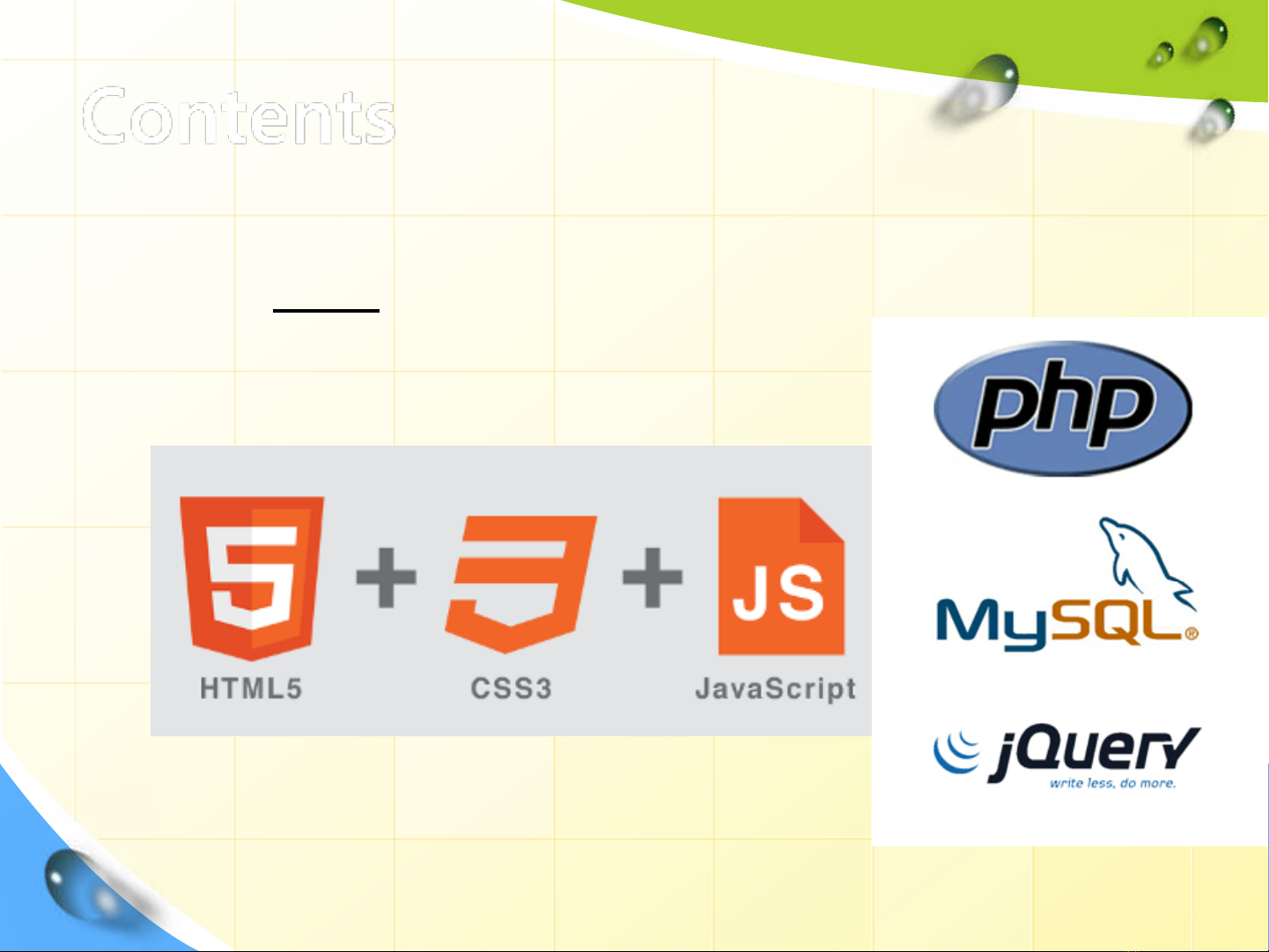
Contents
1. The plan for site Development
2. Advanced CSS
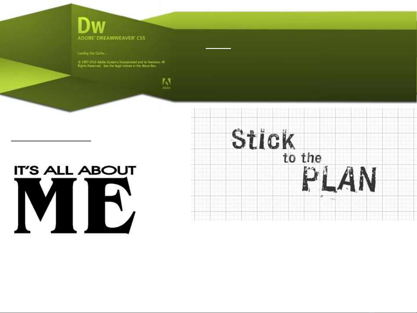
The Plan for Site Development
Course Project:
The “About Me” site
Throughout this course we will be building a personal site with the theme
“about me” as practice for future web projects. Each class we will learn
new techniques for improving and adding features to this site.
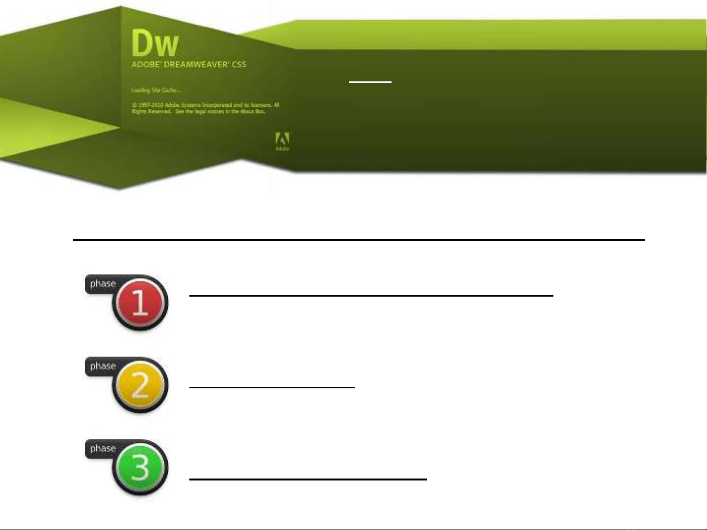
The Plan for Site Development
Phase 1. Information Architecture
Phase 2. Design
Phase 3. Development
Three phases of building a website
The Plan for Site Development
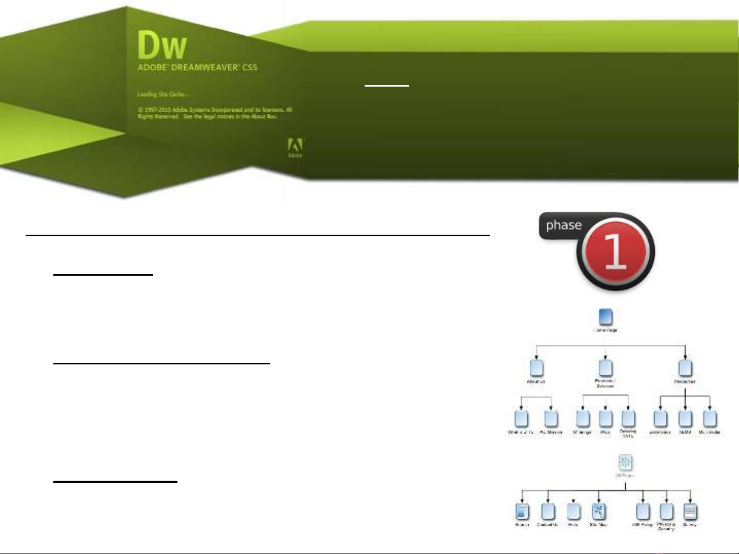
Phase 1. Information Architecture Project
•Discovery - High-level discovery meeting
between the web company and the client.
Define functional requirements.
•Site Map Generation - A useable sitemap is
created that contains a page by page index
of the content information structure in
flow-chart form.
•Aggregation - Gather together as much of
the core content as possible. This includes
media and text.


![Hệ thống quản lý cửa hàng bán thức ăn nhanh: Bài tập lớn [chuẩn nhất]](https://cdn.tailieu.vn/images/document/thumbnail/2025/20251112/nguyenhuan6724@gmail.com/135x160/54361762936114.jpg)
![Bộ câu hỏi trắc nghiệm Nhập môn Công nghệ phần mềm [mới nhất]](https://cdn.tailieu.vn/images/document/thumbnail/2025/20251111/nguyenhoangkhang07207@gmail.com/135x160/20831762916734.jpg)