82 How to Display Data
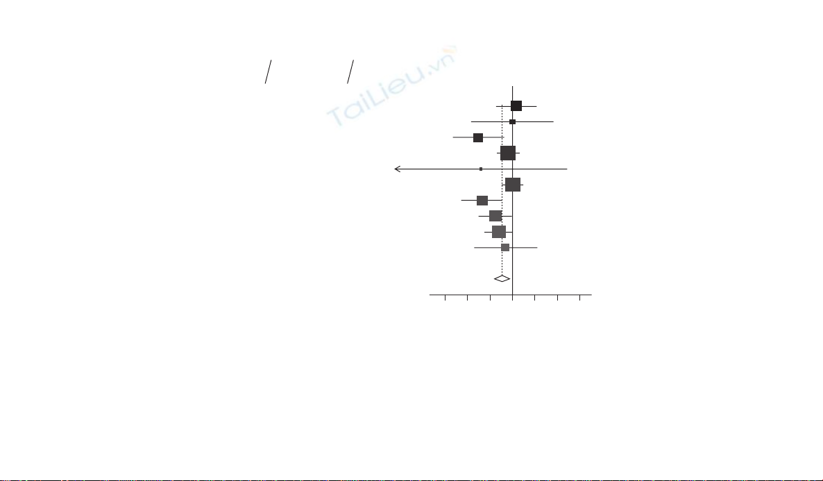
Figure 7.6 Forest plot of OR of death or acute coronary syndrome (for statins vs. no statins) in 10 non-cardiac surgery studies investigating
the use of statins during the perioperative period to reduce the risk of cardiovascular events.11
0.1 0.2 0.5 1 2 5 10
Boersma et al (2001)
A
bbruzzese et al (2004)
Kertai et al (2004)
Conte et al (2005)
A
mar et al (2005)
Kennedy et al (2005)
McGirt et al (2005)
O’Nell-Callahan et al (2005)
Schouten et al (2005)
W
ard et al (2005)
Study
Statins No statins
% Weight Odds ratio
(95% CI)
11/286
4/94
6/162
48/640
0/31
53/1480
10/657
18/526
22/226
4/72
176/4174
34/997
4/95
45/408
65/756
4/100
64/1803
38/909
38/637
111/755
26/374
429/6834
9.9
3.2
7.1
18.1
0.8
18.7
9.7
12.5
15.0
5.0
1.13 (0.57,2.27)
1.01 (0.25,4.17)
0.31 (0.13,0.74)
0.86 (0.58,1.27)
0.34 (0.02,6.50)
1.01 (0.70,1.46)
0.35 (0.18,0.72)
0.56 (0.31,0.99)
0.63 (0.39,1.01)
0.79 (0.27,2.33)
0.70 (0.53,0.91)Overall (95% CI)
Odds ratio
No. of No. of
events patients No. of No. of
events patients

Reporting study results 83
confi dence interval from each study. The forest plot can also be used for
displaying the results of different outcomes within the same study, provided
that they are measured on the same scale (see Figures 7.2 and 7.3). Figure 7.6
is an example of a forest plot from a meta-analysis of 10 non-cardiac sur-
gery studies investigating the use of statins during the perioperative period
to reduce the risk of cardiovascular events.11 The outcome for each study
was the OR of death or acute coronary syndrome for statins vs. no statins.
Figure 7.6 contains both graphical and tabular elements. Data from each
study are summarised in horizontal rows, with the name of the study’s fi rst
author, the year of publication, summary measure of the treatment effect
and confi dence interval and the percentage weight each study is given in the
overall meta-analysis. The estimates of the treatment effect are marked by
squares and the associated uncertainty shown by horizontal lines extend-
ing between the upper and lower confi dence intervals. The size of the
block varies between studies to refl ect the weight given to each in the meta-
analysis, more infl uential studies having the larger blocks. In addition this
counters a tendency for the viewer’s eyes to be drawn to the studies which
have the widest confi dence interval estimates, and are therefore graphically
more impressive (but are the least signifi cant).12 Sometimes, too, the indi-
vidual lines are ordered by date of study (as here), by some index of study
quality or by the point estimate of effect size.
The overall estimate of effect from all the studies combined is marked at
the bottom of the plot as a diamond, the central points indicating the point
estimate while the outer points mark the confi dence limits. A vertical line
is drawn on the chart at the meta-analytical point estimate. From the plots
it is often possible to assess visually the degree of heterogeneity in study
results by noting the overlap of confi dence intervals of individual studies
with the overall combined point estimate from the meta-analysis.
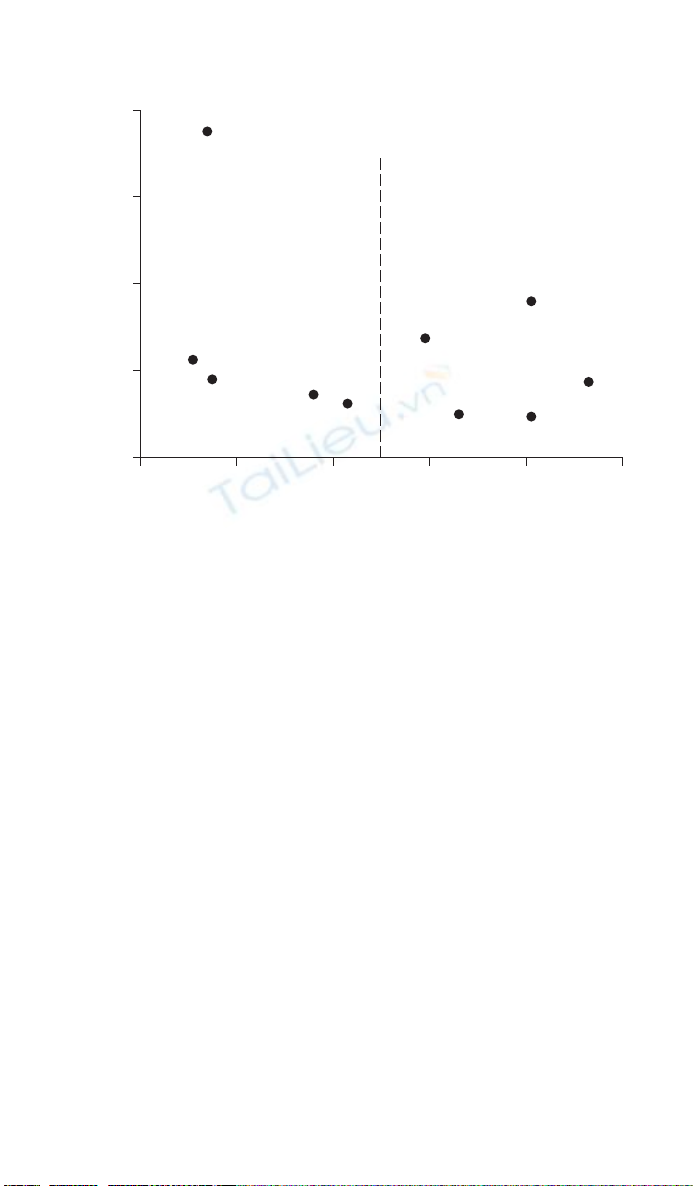
7.12 Funnel plots
Funnel plots are a particular type of scatter plot used to detect publication
bias in meta-analyses and systematic reviews.13 For each study in a review
the estimated treatment effect is plotted against a measure of trial preci-
sion such as the variance or SE of the treatment effect, or study sample size
(Figure 7.7). In a change from the standard graphical practice for scatter
plots where the outcome variable or treatment effect is plotted on the verti-
cal axis (see Chapter 5), funnel plots depict precision (variance of the treat-
ment effect or sample size) on the vertical axis and the treatment effect on
the horizontal axis. The overall combined summary from the meta-analysis
may be marked by a vertical line.
84 How to Display Data
When all study results are published it is expected that the studies will
have a symmetrical distribution around the average or overall effect line,
the spread of studies with low precision being larger than that of studies
with high precision, resulting in a funnel-like shape. Some graphs mark
the funnel with lines within which 95% of studies would fall were there no
between-study heterogeneity. The choice of the measure of treatment effect
and the measure of precision makes a difference to the shape of the plot.
Plots of treatment effects against SEs are usually to be preferred, as the fun-
nel will have straight rather than curved sides.13 However, interpretation of
funnel plots can be diffi cult as there is often an inadequate number of stud-
ies. Assessing the causes of funnel plot asymmetry is also diffi cult because
between study heterogeneity; relationships between study quality and sam-
ple size; and publication bias, can all cause similar patterns in funnel plots.14
7.13 Summary
Multiple logistic regression:
• Report the sample size that the multiple logistic regression model is
based on.
Figure 7.7 Funnel plot of SE of the treatment effect against OR of death or acute
coronary syndrome (for statins vs. no statins) in 10 non-cardiac surgery studies
investigating the use of statins during the perioperative period to reduce the risk of
cardiovascular events, with the overall effect size (OR of 0.70).11
0.2
0.0
0.4
0.8
SE (effect size)
1.2
1.6
0.4 0.6
OR
Overall
effect size
0.8 1.0 1.2

Reporting study results 85
• As a minimum give the estimated OR (for the regression coeffi cient) its
confi dence interval and associated P-value.
• It is also helpful to give the Hosmer and Lemeshow goodness of fi t
test value, degrees of freedom and P-value so that the reader can judge
whether or not the model adequately fi ts the data.
Multiple linear regression:
• As a minimum, give the regression coeffi cient the confi dence interval and
the P-value.
• It is also helpful to give the R2 value so that the reader can judge the
strength of the relationship.
• It can be helpful to give the SE and the t statistics (ratio of coeffi cient to
SE), and also the residual SD, so that prediction error s can be calculated.
Comparing of two or more groups:
• Each column should represent a different group.
• Each row should represent a different outcome variable.
• The number of observations in each group should be stated. If these differ
for different outcome variables (e.g. due to missing values) this should be
clear.
• When presenting means, SD and other statistics, consider the precision of
the original data. Means should not normally be given to more than one
signifi cant fi gure than the raw data, but SD or SEs may need to be quoted
to one extra signifi cant fi gure.
• For continuous outcomes, the SD should be used to show variability
among individuals and the SE of the mean should be used to show the
precision of the sample mean. It should be clear which is presented.
• The symbol should not be used to attach the SE or SD to the mean (as
in 5.7 1.6). It is preferable to present these as 5.7 (SE 1.6) or 5.7 (SD 3.6).
• For binary categorical outcomes, report the proportion or percentage of
the group who have the outcome of interest along with the numerator
and the denominator.
• Percentages should be quoted to no more than 1 decimal for samples of
more than 100. With samples of less than 100 the use of decimal places
implies unreasonable precision and should be avoided.
• When percentages are contrasted it should be clear whether it is the abso-
lute difference or a relative difference that is being reported. For example,
a reduction from 25% to 20% may be expressed as an absolute difference
of 5% or a relative difference of 20%.
• Exact P-values (to no more than two signifi cant fi gures), such as P
0.041 or P 0.59 should be reported. It is not necessary to specify levels
of P lower than 0.001 and this can be written as P 0.001 in the table.

86 How to Display Data
• The coverage of the confi dence interval (e.g. 90% or 95%) should be
clearly stated.
• Confi dence intervals should be presented as ‘1.4 to 12.8’ rather than
using the symbol or the dash symbol to separate the upper and lower
limits.
Randomized controlled trials
• Use the checklist from the CONSORT statement to help with the report-
ing of the trial.
• Include a fl ow diagram to describe the fl ow of patients (and patient num-
bers) through the trial. Make clear the number of patients randomised
and the number of patients with data, available for analysis.
• Summarise the entry or baseline characteristics of the patients in the
study groups with suitable summary statistics using an appropriate table.
(Data for the study groups should be reported in the columns and the
baseline variables by row.)
• Summarise the outcome variables (in rows) for the study groups (in
columns) with appropriate summary statistics in a table. Report the
estimated treatment effect, and its associated confi dence interval (and P-
value) from the comparison of the outcomes between the study groups.
• Use a forest plot to display the quantitative results of studies included in
meta-analyses and systematic reviews. The forest plot can also be used for
displaying the results of different outcomes within the same study, pro-
vided that they are measured on the same scale.
• Use a funnel plot to detect publication bias in meta-analyses and system-
atic reviews.
References
1 Morrell CJ, Walters SJ, Dixon S, Collins K, Brereton LML, Peters J, et al. Cost
effectiveness of community leg ulcer clinic: randomised controlled trial. British
Medical Journal 1998;316:1487–91.
2 Campbell MJ, Machin D, Walters SJ. Medical statistics: a textbook for the health
sciences, 4th ed. Chichester: Wiley; 2007.
3 Hosmer DW, Lemeshow S. Applied logistic regression, 2nd ed. New York:
Wiley; 2000.
4 Thomas KJ, MacPherson H, Thorpe L, Brazier JE, Fitter M, Campbell MJ, et al.
Randomised controlled trial of a short course of traditional acupuncture com-
pared with usual care for persistent non-specifi c low back pain. British Medical
Journal 2006;333:623–6.
5 Bowns IR, Collins K, Walters SJ, McDonagh AJ. Telemedicine in dermatology: a
randomised controlled trial. Health Technology Assessment 2006;10(43):1–58.

![Tài liệu Nhập môn khoa học dữ liệu [Chuẩn nhất]](https://cdn.tailieu.vn/images/document/thumbnail/2026/20260401/baobinh_011/135x160/57531775122890.jpg)


![Tổng quan về Physique: Giới thiệu chung [chuẩn nhất]](https://cdn.tailieu.vn/images/document/thumbnail/2012/20120719/suthebeo/135x160/1214236_349.jpg)


%20--%3e%3cdefs%3e%3cstyle%3e%20.st0%20{%20fill:%20%23fff;%20}%20.st1%20{%20fill:%20%237800fa;%20}%20%3c/style%3e%3c/defs%3e%3cpath%20class='st1'%20d='M117.78,12.18H43.11c2.9,3.47,4.65,7.94,4.65,12.82,0,5.6-2.3,10.66-6.01,14.29h76.02l7.22-13.56-7.22-13.56Z'/%3e%3cg%3e%3cpath%20class='st0'%20d='M53.58,26.17h-.59v-1.46h.59v-4.96h2.83c1.78,0,2.67.94,2.67,2.82v5.76c0,1.87-.89,2.81-2.67,2.81h-2.83v-4.96ZM55.36,21.37v3.34h1.1v1.46h-1.1v3.34h1.01c.61,0,.91-.37.91-1.1v-5.93c0-.74-.3-1.1-.91-1.1h-1.01Z'/%3e%3cpath%20class='st0'%20d='M65.99,31.14h-1.8l-.31-2.07h-2.19l-.31,2.07h-1.64l1.82-11.39h2.62l1.82,11.39ZM65.28,18.04c-.25.46-.51.77-.75.94-.21.15-.47.22-.79.22-.26,0-.57-.07-.92-.22l-.38-.15c-.14-.05-.26-.07-.37-.07-.3,0-.53.18-.71.54l-.91-.68c.25-.46.51-.77.75-.94.21-.14.48-.21.79-.21.26,0,.57.07.92.21l.38.15c.14.05.26.07.37.07.3,0,.53-.18.71-.54l.91.68ZM61.91,27.52h1.73l-.87-5.76-.87,5.76Z'/%3e%3cpath%20class='st0'%20d='M74.53,26.89v1.52c0,1.91-.89,2.86-2.67,2.86s-2.67-.95-2.67-2.86v-5.93c0-1.91.89-2.86,2.67-2.86s2.67.95,2.67,2.86v1.11h-1.69v-1.22c0-.75-.31-1.12-.93-1.12s-.93.37-.93,1.12v6.15c0,.74.31,1.11.93,1.11s.93-.37.93-1.11v-1.63h1.69Z'/%3e%3cpath%20class='st0'%20d='M81.4,31.14h-1.8l-.31-2.07h-2.19l-.31,2.07h-1.64l1.82-11.39h2.62l1.82,11.39ZM75.9,19.2l1.52-1.91h1.71l1.51,1.91h-1.61l-.76-.95-.75.95h-1.61ZM77.32,27.52h1.73l-.87-5.76-.87,5.76ZM83.1,15.99l-1.76,1.91h-1.26l1.17-1.91h1.86Z'/%3e%3cpath%20class='st0'%20d='M84.86,19.75c1.78,0,2.67.94,2.67,2.82v1.48c0,1.87-.89,2.81-2.67,2.81h-.85v4.28h-1.79v-11.39h2.64ZM84.01,21.37v3.86h.85c.58,0,.87-.36.87-1.08v-1.71c0-.71-.29-1.07-.87-1.07h-.85Z'/%3e%3cpath%20class='st0'%20d='M93.51,19.75c1.78,0,2.67.94,2.67,2.82v1.48c0,1.87-.89,2.81-2.67,2.81h-.85v4.28h-1.79v-11.39h2.64ZM92.66,21.37v3.86h.85c.58,0,.87-.36.87-1.08v-1.71c0-.71-.29-1.07-.87-1.07h-.85Z'/%3e%3cpath%20class='st0'%20d='M98.8,31.14h-1.79v-11.39h1.79v4.88h2.03v-4.88h1.83v11.39h-1.83v-4.88h-2.03v4.88Z'/%3e%3cpath%20class='st0'%20d='M105.36,24.55h2.46v1.62h-2.46v3.34h3.09v1.63h-4.88v-11.39h4.88v1.63h-3.09v3.18ZM108.17,17.29l-1.76,1.91h-1.26l1.17-1.91h1.86Z'/%3e%3cpath%20class='st0'%20d='M112.2,19.75c1.78,0,2.67.94,2.67,2.82v1.48c0,1.87-.89,2.81-2.67,2.81h-.85v4.28h-1.79v-11.39h2.64ZM111.35,21.37v3.86h.85c.58,0,.87-.36.87-1.08v-1.71c0-.71-.29-1.07-.87-1.07h-.85Z'/%3e%3c/g%3e%3ccircle%20class='st1'%20cx='25'%20cy='25'%20r='20'/%3e%3cpath%20class='st0'%20d='M32.78,19.27c2.92,0,4.43,2.55,5.28,5.33l.71,2.17c.14.38-.33.75-.71.75h-5.61c.19-.33.24-.71.09-1.08l-.75-2.45c-.43-1.32-.99-2.64-1.79-3.77.75-.57,1.65-.94,2.78-.94h0ZM25,18.38c3.25,0,4.9,2.78,5.89,5.89l.76,2.45c.14.42-.33.8-.8.8h-11.69c-.42,0-.94-.38-.8-.8l.75-2.45c.99-3.11,2.64-5.89,5.89-5.89h0ZM25,11.35c1.74,0,3.11,1.37,3.11,3.11s-1.37,3.11-3.11,3.11-3.11-1.41-3.11-3.11,1.41-3.11,3.11-3.11h0ZM17.27,19.27c1.08,0,1.98.38,2.73.94-.8,1.13-1.37,2.45-1.74,3.77l-.8,2.45c-.14.38-.05.75.09,1.08h-5.56c-.42,0-.9-.38-.75-.75l.71-2.17c.9-2.78,2.41-5.33,5.33-5.33h0ZM17.27,12.91c1.51,0,2.78,1.27,2.78,2.83s-1.27,2.83-2.78,2.83-2.83-1.27-2.83-2.83,1.27-2.83,2.83-2.83h0ZM32.78,12.91c1.56,0,2.78,1.27,2.78,2.83s-1.23,2.83-2.78,2.83-2.83-1.27-2.83-2.83,1.27-2.83,2.83-2.83h0ZM27.07,28.56v.09c0,.57-.24,1.08-.61,1.46h0v.05c-.38.33-.9.57-1.46.57s-1.08-.24-1.46-.61h0c-.38-.38-.61-.9-.61-1.46v-.09h1.41v.09c0,.19.05.38.19.47v.05c.09.09.28.19.47.19s.38-.09.47-.19v-.05c.14-.09.24-.28.24-.47t-.05-.09h1.41ZM30.99,28.56v.09c0,1.65-.66,3.16-1.74,4.24-1.08,1.08-2.59,1.79-4.24,1.79s-3.16-.71-4.24-1.79l-.05-.05c-1.04-1.08-1.7-2.55-1.7-4.2v-.09h1.41v.09c0,1.27.47,2.4,1.27,3.25h.05c.85.85,1.98,1.37,3.25,1.37s2.4-.52,3.25-1.37c.85-.8,1.37-1.98,1.37-3.25v-.09h1.37ZM34.99,28.56v.09c0,2.78-1.13,5.28-2.92,7.07-1.79,1.79-4.29,2.92-7.07,2.92s-5.23-1.13-7.07-2.92c-1.79-1.79-2.92-4.29-2.92-7.07v-.09h1.41v.09c0,2.4.94,4.53,2.5,6.08,1.56,1.56,3.72,2.5,6.08,2.5s4.52-.94,6.08-2.5c1.56-1.56,2.5-3.68,2.5-6.08v-.09h1.41Z'/%3e%3c/svg%3e)