CHƯƠNG 3: UI & UX TRONG THIẾT KẾ WEBSITE

32

CHƯƠNG 3: UI và UX trong thiết kế website

! Khái niệm về UI và UX

! Thói quen trải nghiệm của người dùng

! Cách thiết kế giao diện tổng quan

! Cách thiết kế bố cục trang

! Cách thiết kế đồ hoạ

33

Học lập trình trực tuyến tại itclass.vn

Khái niệm về UI và UX (tt)

! UX (USER EXPERIENCE) là gì?

! UI (USER INTERFACE) là gì?

34

Học lập trình trực tuyến tại itclass.vn

c h a pt e r 1

d o n’ t m a k e m e t h i n k !

Think of it this way:

But when I’m looking at a page that makes me think, all the thought balloons Thói quen trải nghiệm người dùng over my head have question marks in them.

When I’m looking at a page that doesn’t make me think, all the thought balloons over my head say things like “OK, there’s the _____. And that’s a _____. And there’s the thing that I want.”

NOT THINKING

THINKING

OK. This looks like the product categories...

Hmm. Pretty busy. Where should I start?

Is that the navigation? Or is that it over there? ...and these are today’s special deals.

Why did they put that there?

Hmm. Why did they call it that?

Memory, Modems... There it is: Monitors. Click

Can I click on that?

Those two links seem like they’re the same thing. Are they really?

35

Học lập trình trực tuyến tại itclass.vn

When you’re creating a site, your job is to get rid of the question marks.

[ 12 ]

[ 13 ]

c h a pt e r 1

d o n’ t m a k e m e t h i n k !

Thói quen trải nghiệm người dùng

Another example: On most bookstore sites, before I search for a book I first have to think about how I want to search.2

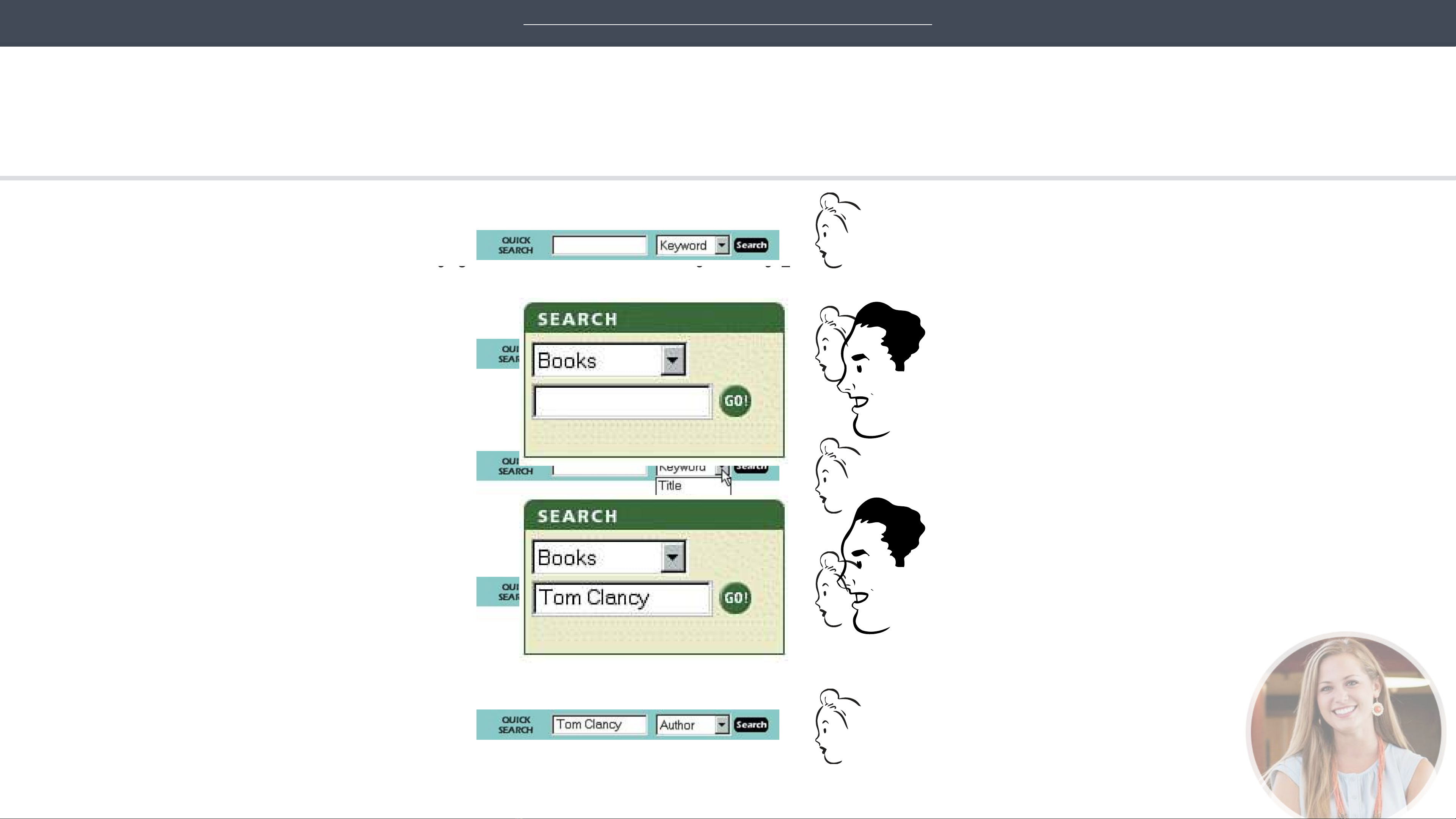
MOST BOOKSTORE SITES

Let’s see. “Quick Search.” That must be the same as “ Search,” right?

Amazon.com, on the other hand, doesn’t even mention the Author-Title-Keyword distinction. They just look at what you type and do whatever makes the most sense.

Do I have to click on that drop-down menu thing?

AMAZON.COM

All I know about the book is that it’s by Tom Clancy. Is Clancy a keyword?

OK. “Search books for _____.”

(What is a keyword, anyway?)

I guess I have to use the menu.

Clicks on the arrow

Types “Tom Clancy”

Title. Author. Keyword.”

Clicks “Go”

OK. I want “Author.”

Clicks “Author”

Types “Tom Clancy”

Clicks “Search”

Học lập trình trực tuyến tại itclass.vn

innocent as jazzing up a well-known name (from “Search” to “Quick Search”) can

After all, why should I have to think about how I want to search? And even worse, why should I have to think about how the site’s search engine wants me to 36 phrase the question, as though it were some ornery troll guarding a bridge? (“You Granted, most of this “mental chatter” takes place in a fraction of a second, but you can see that it’s a pretty noisy process. Even something as apparently forgot to say ‘May I?’”)

generate another question mark.

I could list dozens of other things that visitors to a site shouldn’t spend their time

2 This was still true when I checked about a year ago. Only now, in 2005, have most of them

finally improved.

thinking about, like:

> Where am I?

[ 16 ]

> Where should I begin?

> Where did they put _____?

> What are the most important things on this page?

> Why did they call it that?

But the last thing you need is another checklist to add to your stack of Web

design checklists. The most important thing you can do is to just understand the

basic principle of eliminating question marks. If you do, you’ll begin to notice all

the things that make you think while you’re using the Web, and eventually you’ll

learn to recognize and avoid them in the pages you’re building.

[ 17 ]

Why are things always in the last place you look for them?

Because you stop looking when you find them.

—children’s riddle

h ow w e r e a lly u s e t h e w e b

people use the Web, and the thing that has struck me most is the difference

between how we think people use Web sites and how they actually use them.

> We’re good at it. We’ve been scanning newspapers, magazines, and books all

In the past ten years i’ve spent a lot of time watching

our lives to find the parts we’re interested in, and we know that it works.

When we’re creating sites, we act as though people are going to pore over each

page, reading our finely crafted text, figuring out how we’ve organized things,

The net effect is a lot like Gary Larson’s classic Far Side cartoon about the

and weighing their options before deciding which link to click.

difference between what we say to dogs and what they hear. In the cartoon,

the dog (named Ginger) appears to be listening intently as her owner gives her

What they actually do most of the time (if we’re lucky) is glance at each new page,

a serious talking-to about staying out of the garbage. But from the dog’s point scan some of the text, and click on the first link that catches their interest or of view, all he’s saying is “blah blah GINGER blah blah blah blah GINGER vaguely resembles the thing they’re looking for. There are usually large parts of blah blah blah.” the page that they don’t even look at.

Thói quen trải nghiệm người dùng

What we see when we look at a Web page depends on what we have in mind, but it’s usually just a fraction of what’s on the page.

We’re thinking “great literature” (or at least “product brochure”), while the user’s reality is much closer to “billboard going by at 60 miles an hour.”

WHAT DESIGNERS BUILD…

WHAT USERS SEE…

WHAT WE DESIGN FOR… THE REALITY…

Read

Look around feverishly for anything that

Read

I want to buy a ticket.

Read

Read

a) is interesting, or vaguely resembles what you’re looking for, and

[Pause for reflection]

b) is clickable.

Finally, click on a carefully chosen link

As soon as you find a halfway-decent match, click.

How do I check my frequent flyer miles?

If it doesn’t pan out, click the Back button and try again.

37

Học lập trình trực tuyến tại itclass.vn

Like Ginger, we tend to focus on words and phrases that seem to match (a) the task at hand or (b) our current or ongoing personal interests. And of course, (c) the

trigger words that are hardwired into our nervous systems, like “Free,” Sale,” and

[ 21 ]

“Sex,” and our own name.

[ 23 ]

c h a pt e r 6

Thói quen trải nghiệm người dùng

Here’s what the process looks like:

Enter site

> Feel like browsing?

NO YES

>

>

>

> Find a search box

Click on a section

>

>

> Type your query

> Click on a subsection

NO

YES NO

> Look for whatever it is

> Credible results?

>

>

Think you’re in the right section?

YES

>

Find it?

Devise a better query >

>

NO

>

YES Scan results for likely matches

NOT YET ALMOST

>

Check them out NOT YET THOROUGHLY FRUSTRATED?

>

>

YES

Find it? NO YES YES

>

>

> LEAVE HAPPY

38

Học lập trình trực tuyến tại itclass.vn

[ 56 ]

HAD ENOUGH? > LEAVE UNHAPPY

Cách thiết kế Giao diện tổng quan

! Định hướng cho người dùng

! Trang không có liên kết tới các trang khác

! Hỗ trợ tìm kiếm

39

Học lập trình trực tuyến tại itclass.vn

Giúp đỡ định hướng rõ ràng

Định hướng cho người dùng

! Trang web cần hỗ trợ người dùng như sau:

!  Ngưởi dùng có thể trả lời các câu hỏi:

!  Đang ở đâu ? !  Có thể làm gì ? !  Có thể đi tiếp tới đâu ?

!  Biểu tượng nhất quán, dễ hiểu, theo ! Sử dụng sự nhất quán trong thiết kế giữa các

chuẩn qui định đối tượng trên các trang

40

Học lập trình trực tuyến tại itclass.vn

5

Không có trang cuối cùng (dead- end)

!  Trang “dead-end” " thất vọng, mất khả

Liên kết đến các trang khác năng đến với các trang khác.

! Trên mỗi trang cần có các liên kết tới các trang khác !  Mỗi trang có ít nhất một liên kết. Luôn có khả năng quay lại trang chủ hoặc các trang chủ chốt trên Website

8

41

Học lập trình trực tuyến tại itclass.vn

Hỗ trợ tìm kiếm

! Bất kì trang web nào cũng nên có công cụ tìm kiếm

Hỗ#trợ#'m#kiếm#

10

42

Học lập trình trực tuyến tại itclass.vn

Cách thiết kế bố cục trang web

Page Design

!  Bố cục Layout !  Kích thước Khung nhìn !  Tính nhất quán !  Tính ổn định !  Tương thích trình duyệt

43

Học lập trình trực tuyến tại itclass.vn

12

Bố cục layout

Bố#cục#Layout#

13

44

Học lập trình trực tuyến tại itclass.vn

Xác định kích thước khung nhìn

Kích thước khung nhìn !  Phải làm cho người dùng cảm nhận được Xác định kích thước khung nhìn kích thước của trang thông tin, biết họ đang ở đâu, có thể làm gì ?

!  Lưu ý, hầu hết các trang web đều không

!  Phải làm cho người dùng cảm nhận được kích thước của trang thông tin, biết họ đang ở đâu, có thể làm gì ? vừa khớp với màn hình 14-15 inch.

!  Lưu ý, hầu hết các trang web đều không

vừa khớp với màn hình 14-15 inch.

45

Học lập trình trực tuyến tại itclass.vn

17

17

Tính nhất quán

! Thiết kế phải tuân theo trang chủ

! Cấu trúc giữa các trang tương đối giống nhau

46

Học lập trình trực tuyến tại itclass.vn

Tính tương thích trên các trình duyệt

! Trang web của chúng ta cần hiển thị được trên tất cả các trình duyệt, trên các thiết bị

47

Học lập trình trực tuyến tại itclass.vn

Thiết kế đồ hoạ cho website

Xác định kiểu chữ, màu sắc

!  Phông chữ " phụ thuộc vào

!  Đặc điểm thông tin !  Độc giả !  Trình duyệt, độ phân giải !  Ngôn ngữ sử dụng !  Font có chân, không chân…

!  Gam màu ! thống nhất trong toàn bộ

Website

!  Font tiếng Việt: VNI, TCVN3, Unicode…

23

48

Học lập trình trực tuyến tại itclass.vn