YOMEDIA
ADSENSE
Modern Design - Thiết kế chuyên nghiệp phần 4
93
lượt xem 11
download
lượt xem 11
download
Download
Vui lòng tải xuống để xem tài liệu đầy đủ
Tham khảo tài liệu 'modern design - thiết kế chuyên nghiệp phần 4', công nghệ thông tin, đồ họa - thiết kế - flash phục vụ nhu cầu học tập, nghiên cứu và làm việc hiệu quả
AMBIENT/
Chủ đề:
Bình luận(0) Đăng nhập để gửi bình luận!
Nội dung Text: Modern Design - Thiết kế chuyên nghiệp phần 4
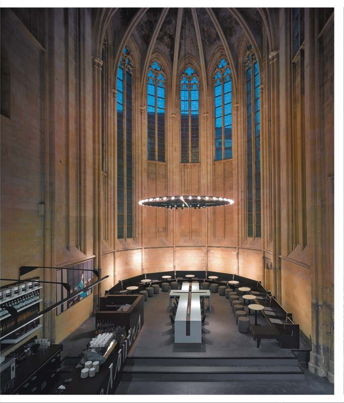
- Selexyz bookstore Perhaps if more bookstores looked like this, we’d be more inclined to get stuck into a good book every now and then. Like the Bible, for instance. Located in the Netherlands and designed by Merkx + Girod, the revamp respects the church’s original classical architecture while introducing a modern flare + .. Unless you like cold stone, classic arches, stained glass, eerie relics and musty smells, then you probably won’t appreciate the beauty of churches. In a bid to make them more aesthetically-pleasing to the mainstream congregation, an architectural trend has arisen in design that sees the traditional place of worship transformed into places even the sexy, stylish and sophisticated would worship. We can’t work out whether there’s something sacrilegious about the whole thing, but we’re fascinated by it, nevertheless. So much so that we’ve cleverly coined our own term for the movement; divine design. Text: N ick Clarke P hotos: Courtesy of mentioned churches 48 Modern Design
- Converting churches into homes, shops, restaurants and nightclubs, there’s seemingly no end to the possibilities when it comes to outing the old and introducing the new. Call us a stick in the mud, but we do imagine we’d feel a little uncomfortable downing tequila shots and revelling like rock stars under the watchful eye of the Virgin Mary or the looming shadow of a crucifix. But the innovative reuse of churches is bringing people back through their heavy wooden doors, even if it is to a Sunday booze-up rather than a Sunday mass.
- Alma De Cuba We’re particularly devoted to Chapel Utrecht (right to think the sacrifice would be worth making. The Lord provides… You’ll get to enjoy more than page), which sees a simple church building con- Using an 800-year-old Dominican church as its lat- wine and bread if you take your communion here. verted into a minimalist, city-slicker pad by Marnix est branch, upscale Netherlands bookstore Selexyz Built inside St Peter’s Catholic Church, Alma de Van De Meer and Rolf Bruggink’s Utrecht-based ar- has found home is where the holy water is in Cuba is one of Liverpool’s most lavish venues + chitecture studio, Zecc. The redesign incorporates Maastricht, a bible’s throw from the Belgian border. .. many of the church’s original features, such as the Just 100 miles from the aforementioned Chapel gothic-style stained glass windows, stone cruci- Utrecht, this conversion is courtesy of Amsterdam- fixes and original choir organ, while simultane- based architects Merkx + Girod and makes the best ously implementing super-modern aspects, such use of minimal floor space by building upwards as whitewashed spaces and abstract shapes. The rather than outwards. A temple to literature, the organ, which sits on the balcony, acts as both a Boekhandel Selexyz Dominicanen overlays a sleek, focal point and room divider, successfully section- minimalist design onto the framework of ing off the living room, bedroom, kitchen, dining area and study. The lead of the windows remains, too, creating a striking contrast with the polished white finishes. The design even reuses the church benches as a dining table. New elements include a number of skylights installed in the slanting roof and a completely new window introduced at the front of the building. Indeed, with angelic light shining onto its inhabitants, this could well be the perfect pad for a superstar looking to change their image from wild child to born-again Christian. Per- haps a post-crack Whitney Houston or a recently rehabbed Britney could have a viewing? While it would be a little strange indulging in any sinful activities in this Netherlands nest, we’re inclined 50 Modern Design
- Chapel Utrecht Going to the chapel… While it may look like a city- slicker-style bachelor pad, this beautiful abode is actually built inside Chapel Utrecht. Stark but styl- ish, this is one place we wouldn’t mind congregat- ing at. Photos courtesy of Cornbread Works +
- the original classic architecture, clashing dark steel is also marked by dark wood furniture, chandeliers bookcases against intricately carved stone walls. A made from antlers, religious paintings and a mez- Coffee Lovers café has been installed near the end, zanine restaurant that overlooks the ‘pulpit’ below. Viikki Urban Centre where bookworms can sit against tall pillars and While it’s still used as a church, that didn’t hold You’ve gotta’ have faith … With a wooden interior, get lost in The New Testament. As with another back Finland-based JKMM Architects when they the church at the Viikki Urban Centre draws is conversion in the area – The Kruisherenhotel, a were asked by the Parish of Helsinki to come up vaguely reminiscent of Noah’s Ark. Minus the + former monastery – local authorities insisted that with a modern design for the chapel at the Viikki animals, of course .. Chapel utrecht mondrian style windows the bookstore conversion could be reversed easily Urban Centre. Characterised by aspen shingles, to the other side. With most resurrected and inexpensively in the future. Meanwhile, many of which have turned grey since it was built churches being houses of Christianity, it’s only a little closer to home in Liverpool, Alma De Cuba in 2005, the wooden interior also features a luxuri- a matter of time before Tom Cruise drives funds is one of England’s most striking church adapta- ous golden silkscreen behind the altar and dozens into the building of a slick Scientology shrine or tions. A mecca for peroxide-blonde footballers’ of rectangular lights that dangle from the ceiling. Madonna forgoes another adopted child in place wives everywhere, the snazzy Latin restaurant and Huge glass windows run along one side to allow of a cool Kabbalah centre. Who knows, perhaps bar fuses glamorous décor with the original archi- for sweeping views across the adjoining field, Bin Laden has transformed his local mosque into tecture of St Peter’s Catholic Church in Seel Street. while also shedding light where there was none. a Batman-style hideout? Now when you say you’re With vaulted ceilings, labyrinth-like passageways, Naturally, traditional church elements still remain, going to the chapel, you’re not necessarily going authentic church candles flickering in darkened and the adjoining congregation hall is like a giant to get married. It might be for a bite to eat, a little nooks, green palms set against stained glass and wooden cathedral or the upside-down hull of retail therapy, a boogie on the dance floor or even Mojitos served on an altar-like bar, this hip hang- Noah’s Ark. Filled with light that’s almost blinding for a little rest and relaxation in the comfort of out is devilishly decadent. Set against the sound of at the end of the tunnel-like structure, churchgo- your very own home. Whatever it is, this is what salsa music rather than a chorus choir, the design ers may feel like they’ve already crossed over we call design intervention. 52 Modern Design
- SNEAKERS WITH SOUL A staple part of any geek-about-town’s wardrobe – and we mean that in the nicest possible way! – Converse’s All-Star sneakers come in all shapes, styles and sizes. Now they even come in a limited-edition ‘band-aid’ style, though it’s not another charity venture of Bob Geldof’s, thank God! As part of project RED – a charity that fights against HIV and AIDS in Africa – Converse has brought together 100 artists from across the globe to create unique designs for the brand. Part of the cleverly-named 1HUND(RED) campaign – geddit? – these snazzy sneakers are designed by Darren Romanelli and feature leather with laser-etched graphics and a subtle skull WHAT AN print on the sole. With 10% of all sales in the campaign donated to the cause, we certainly ENSEMBLE wouldn’t mind slipping our weary feet into a pair of these! www.drromanelli.com Designer Roel Vandebeek sure knows how to bring people together. His latest creation for Wolters, a firm that specialises in products for the street, is a bench called Ensemble© that encourages social interaction through its clever design. RING ME Comprising three separate benches that are connected by metal strips, the unusual angles created enable people to sit either individually or in groups. Incredibly, the While we can’t imagine a woman being best arrangement allows everyone to feel pleased if she were proposed to with a concrete included, without encroaching on one ring instead of a diamond one that comes in a another’s personal space. Made from turquoise Tiffany & Co. box, these handmade wood and metal, the benches feature rings are the perfect antidote to all the girly pure, minimalist lines and bold colours jewellery out there. Available with smooth that can be customised to suit any setting. or jagged edges for both women and men, Certainly, this is one bench tramps won’t the handmade rings are available exclusively mind kipping on. Tel. (+34 ) 902 900 679 through designboom. www.streetdesign.es www.designboom.com/shop.html NICE RACK This colourful creation is an imaginative take on the traditional magazine rack, and we rec- ommend you buy one immediately so you have a suitably chic place to store all your back- issues of Modern Design. Created by design team Giusi & Fabio Lombardo for Casamania, Print, as it has been cleverly named, is made from only one transparent methacrylate sheet and is sculpted into a series of curvaceous waves. Whoever said print was dead was clearly very much mistaken. www.casamania.it 54 Modern Design
- LET IT SHINE A series of suspension lights in four distinctive shapes, Tom Dixon’s Beat Light is sure to bring glamour and luxury to even the grottiest crack den. Featuring wide, fat, tall and stout shapes, the light sounds suspiciously like a description of Take That, but we’re loving it, nevertheless. www.tomdixon.net ZiG-SAW While you may not be familiar with the furniture of Ryan Frank yet, GOING ROCOCO you soon will be; he was recently named in The Observer’s ‘New Faces of 2008’, as well as appearing in Time Magazine’s ‘Who’s Who: The Eco Guide’. One of is his designs, named ZiG, is garnering particular Specialising in the rococo style popular in the latter part of the eighteenth century attention for its looks and dynamism. A modular display/storage system – characterised by an ornate, floral style – Smånsk Design Studio successfully brings made from solid bamboo, the two separate units link together like a the past back into vogue. Offering a fresh spin on the design principles of the old- jigsaw to create a striking array of negative spaces. Easily moveable world concept, the Haupt commode takes its signature swirls and flourishes and on castor wheels, ZiG can be pushed around your apartment as much translates them into an angular design, complete with jutting lines and boxy shapes. as you like; one day you might want it in the living room, the next you Nevertheless, the modernised white unit is unmistakably rococo, and would make a may think it would look better in the study. Using only sustainable, fantastic feature in any stark, minimalist abode. salvageable materials to build what he dubs as ‘free-range’ furniture, www.smansk.com everyone will want a piece of Frank soon, so get in there quick. www.ryanfrank.net 55 Modern Design
- DINNER PARTY If more people had dining tables like this, perhaps there would be more dinner parties to attend! Part of the stunning collection at BoConcept, one of Denmark’s most influential furniture chains, the Amari Dining Table is sophisticated, stylish and sleek. Tucked underneath are the ultra-swish Mariposa Deluxe Chairs, which would have even the ugliest duckling sitting pretty. Topped off with select pieces from BoConcept’s gorgeous accessory range, such as the flamboyantly-shaped Black Aluminium Candlestick, this set-up will ensure that your guests well and truly outstay their welcome. www.boconcept.com SITTING PRETTY BOOK IT We love pretty much all the seating B&B Italia churns out, but we’re Designed by Mehdi Izemrane, the Paraphe bookcase is everything you particularly enamoured with the Mart Chair. Designed by Antonio Citterio, need to store your treasured tomes on art and architecture. Featuring the Mart Chair sits on a swivel base – which can be disc-shaped or cross- chrome metal and four glass shelves, it’s a sleek, sophisticated way to show shaped, depending on your preference - and is available in both larger and off how well-read you are – even if you do only own glossy photo-books. smaller variations. With a choice of leather or fabric upholstery, as well as a www.rochebobois.com low or high back, the Mart Chair is as dynamic as our everyday lives. Now sit. www.bebitalia.it Much of this month’s shopping appeared in the Salone de Mobile 2008. We’ll go into more depth next issue, but for now feast your eyes on this little lot.
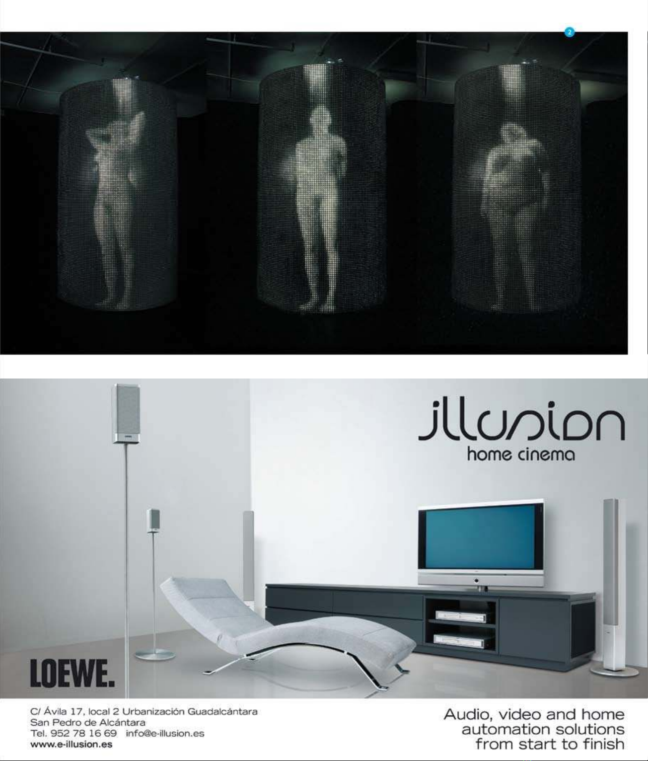
- I mage courtesy of Jordan Eagles
- Text: N ick Clarke P hotos: Courtesy of Benny Chan of Fotoworks .............................................................................. Skyline reSidence BeST SeATS in THe HOUSe .............................................................................. The lighTs, The cameras, The acTion; everyone who’s anyone wanTs a home in The hollywood hills. BuT even movie sTars would sTruggle To maTch Their sprawling hillside homes and maliBu mansions To This, The appropriaTely- named skyline residence. overlooking downTown la and hollywood, The minimalisT dwelling Belongs To archiTecT hagy BelzBerg, who, incidenTally, inTerned wiTh Frank gehry, and FeaTures cuTThroaT lines, uninTerrupTed space, uncluTTered rooms and exTensive deTailing. designed By The 13-sTrong Team aT his sanTa monica-Based sTudio, BelzBerg archiTecTs, The house was BuilT wiTh BeauTy, BudgeT and The environmenT in mind, and we have To admiT, we’re in love wiTh every square FooT iT (5,000, To Be precise). 58 Modern Design
- When the director shouts ‘cut!’, the Hollywood fantasy usually melts away as sets are deconstructed and reality steps into the frame; not so with the Skyline Resi- dence, whose architecture and ambience make for blockbust- er living from dusk ‘til dawn, 365 days a year
- Developed for no more than $180 per square- metre, the Skyline Residence is proof that sustainability and style don’t have to be at the cost of bankruptcy, with eco-concepts incorporated into the sleek design; air-conditioning is replaced by natural cooling that harnesses the wind from the valley; electric lighting is reduced by natural of the house, though, is the outdoor home cinema, sunlight that filters in through floor-to-ceiling where movies are projected from the ground windows; and all-natural resources are gathered onto a screen that’s mounted on an outside wall from nearby sites to reduce transportation and watched from a viewing platform situated emissions. Because of these features and the way above the garage. Indeed, there would be nothing it is built, the design has very little impact on its better than snuggling up beneath the stars with surroundings. Making the best use of the difficult a wannabe actress, the twinkling lights of the city construction site – a compressed ridge with only in the distance and Clark Gable and Vivien Leigh a narrow slither of workable land – the Skyline getting it on in front of you. Certainly, it’s more Residence demonstrates that a consideration private than a viewing down at Sunset Boulevard’s for site conditions and local climate reduces Grauman’s Chinese Theatre! In addition to housing architecture’s imposition on a landscape. The earth its own premiere-worthy, drive-in-style screen, the beneath Belzberg’s house is partially composed Skyline Residence also boasts a 65-foot infinity of granite, making the prospect of excavation pool that overlooks the valley, spacious terraces extremely difficult; fortunately, the architect that are perfect for dining al fresco on and a discovered that a network of underground roots secluded guesthouse where Belzberg undoubtedly – supplied by the thick brush that grows across accommodates visiting friends and family.. the hillside – made the land more solid, meaning One of the most interesting aspects of the Skyline extensive excavation and complex foundations Residence is that it was built on such a small weren’t necessary. Interestingly, the little granite budget, proving that even those watching their that was dug up was used under concrete slabs pennies can achieve modern design and economy. to level drainpipes and as a walking surface for While this abode is inspired by the glamour of the viewing platform. Aesthetics aren’t Hollywood and its celluloid-starring inhabitants, given a backseat, either, with upscale fittings you don’t necessarily need a movie star’s payroll to and at least one wall of each room made from realise your architectural dreams – though let’s face glass to make the best use of the picturesque it, it would be nice. Californian views. We particularly like the floating orb fireplace in the living room. The main feature More info> www.belzbergarchitects.com 60 Modern Design
ADSENSE
CÓ THỂ BẠN MUỐN DOWNLOAD
Thêm tài liệu vào bộ sưu tập có sẵn:
Báo xấu
LAVA
AANETWORK
TRỢ GIÚP
HỖ TRỢ KHÁCH HÀNG
Chịu trách nhiệm nội dung:
Nguyễn Công Hà - Giám đốc Công ty TNHH TÀI LIỆU TRỰC TUYẾN VI NA
LIÊN HỆ
Địa chỉ: P402, 54A Nơ Trang Long, Phường 14, Q.Bình Thạnh, TP.HCM
Hotline: 093 303 0098
Email: support@tailieu.vn